Hero donate
the donation hero
This tailwind example is contributed by Uwera Dorcas, on 27-May-2025. Component is made with Tailwind CSS v3. It is responsive. similar terms for this example are simulation,copy,dummy,miniature,like

Author Uwera Dorcas
Related Examples
-
 Tailwind CSS Service Card Component
An HTML and Tailwind CSS code snippet for creating a responsive service card component. Ideal for marketplaces, portfolios, or listing pages. Includes sections for image/video preview, seller info, rating, pricing, and additional details. Easy to customize using Tailwind utility classes.
10 months ago1.2k -
 Modern Dark Footer with Overlapping Gradient CTA
A comprehensive, dark-themed website footer component built with HTML and Tailwind CSS. It features a visually distinct overlapping section with a colorful gradient background containing a prominent call-to-action (CTA) block. The main footer area utilizes a multi-column grid layout for organized navigation links, a newsletter signup form, and social media icons. A final bottom bar includes legal links and copyright information. The design is responsive and adapts its layout for different screen sizes.
10 months ago1.1k -
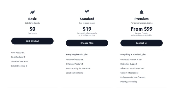 Responsive 3-Tier Pricing Card Section
A clean and responsive pricing table component featuring three distinct tiers (e.g., Basic, Standard, Premium) presented in a card layout. Built with HTML and Tailwind CSS, it stacks vertically on small screens and transitions to a side-by-side view on medium screens (md breakpoint - 768px) and up. Each plan card includes a placeholder icon, title, description, price details, a call-to-action button, and a bulleted list of features with checkmarks. The generic content makes it easy to adapt for various websites or applications needing a clear pricing comparison structure.
10 months ago614 -
 iPhone 15 Mockup
The "Screen Content" div can be manipulated to have anything inside the screen.
1 year ago1.6k -
 Calculator
This calculator uses CSS although it can be passed directly to tailwind
1 year ago2.2k -
 3 months ago211
 -
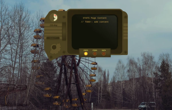 CSS-Boy
Inspired by the Pip-Boy Model 3000 from Fallout: New Vegas. Comes with multiple pages and some animations. All decorative background elements disappear when the screen is <sm (it's responsive).
9 months ago888 -
 3 years ago10.6k
 -
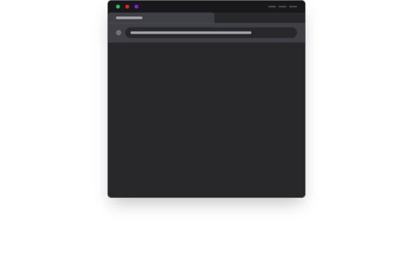 Website Mockup
An Onyx Component. This can be used for landing pages / other website mockup purposes. It's clean design will fit with most SAAS projects.
1 year ago1.9k -
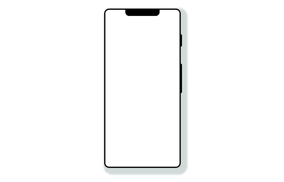 Mobile device mockup
Smartphone (with notch) mockup in tailwind
3 years ago10.8k -
 3 years ago8.8k
 -
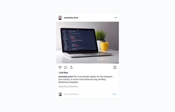 Instagram Post UI Mockup
A static HTML and Tailwind CSS component that visually replicates the user interface of an Instagram post. This mockup includes the post header (avatar, username, options), image area, action buttons (like, comment, share, save), like count, caption, and comment section. It features responsive constraints and supports both light and dark mode, closely mimicking the look and feel of the actual Instagram app. Ideal for UI prototyping, style guides, or frontend development practice.
10 months ago1.4k


Explore components by Tags
Didn't find component you were looking for?
Search from 3000+ components