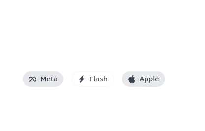
Company icons chips
This tailwind example is contributed by Steven Kuhn, on 14-Jan-2023. Component is made with Tailwind CSS v3. It is responsive. similar terms for this example is tags

Author Steven Kuhn
Related Examples
-
 3 years ago13.1k
 -
 3 years ago10.2k
 -
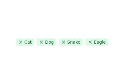 Tags list
click to remove the tag from list
2 years ago11.4k -
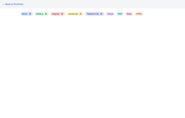 chip
chipInteractive and customizable chips or tags to display labels, categories, or filters. Includes options for removable chips with icons and different styles.
1 year ago1.6k -
![Material 3 Chips [Light]](https://tailwindflex.com/storage/thumbnails/material-3-chips-light/canvas.min.webp?v=11) Material 3 Chips [Light]
Material 3 Chips [Light]Chips that conform to Google's Material 3 design guidelines
9 months ago815 -
 Services showcase Section
With hover effect on cards
1 year ago2.5k -
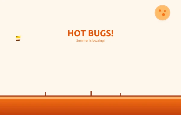 Bug Beach Day Heatwave
This playful animation brings sweltering summer insects to life with pure HTML and Tailwind CSS. Watch as: 🔥 Glowing Fireflies pulse with heat-radiant light, their wings shimmering in the desert sun 🐞 Overheated Ladybugs scuttle across cracked earth, their red shells reflecting the blazing heat ☀️ A Wobbling Sun dominates the sky, emitting pulsing heat waves across the animated landscape
9 months ago1.1k -
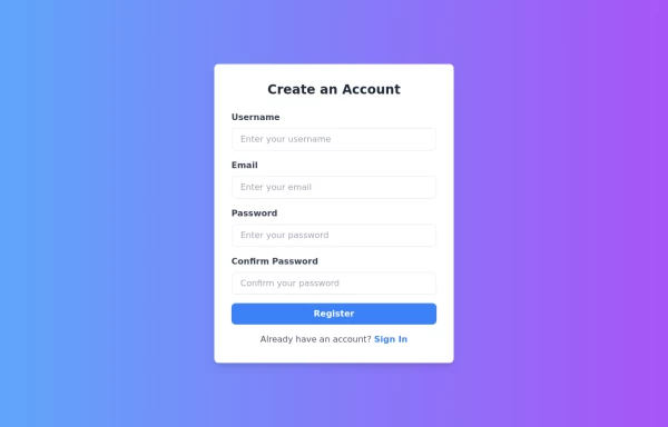 Responsive Registration Page
I created a responsive and visually appealing registration page using TailwindCSS and HTML5. This page features a gradient background, a modern card-style form, and clear input fields for username, email, password, and password confirmation. It includes client-side validation with real-time error messages to ensure all required fields are filled correctly and passwords match. This form is designed to provide a seamless user experience across all devices.
1 year ago3.3k -
 2 years ago12k
 -
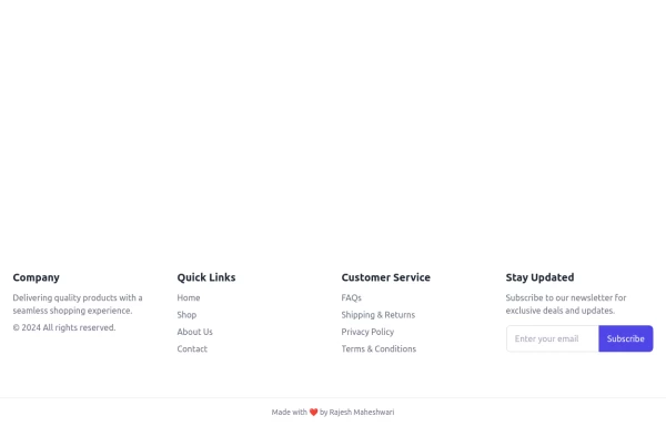 Footer
Footer with responsive desing
1 year ago1.4k -
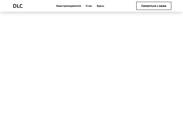 Navbar
Navbar
6 months ago541 -
 Invoice
Invoice
1 year ago2.7k


Explore components by Tags
Didn't find component you were looking for?
Search from 3000+ components