Call to action
This tailwind example is contributed by Piet Vriend, on 16-Jan-2023. Component is made with Tailwind CSS v3. It is responsive. It supports dark mode. similar terms for this example are CTA,banner,banner

Author Piet Vriend
Related Examples
-
 3 years ago10.4k
 -
 3 years ago8.9k
 -
 3 years ago9.1k
 -
 3 years ago10.1k
 -
 3 years ago10.6k
 -
 3 years ago10k
 -
 3 years ago12k
 -
 3 years ago12k
 -
 Greeting Card with CTA
card with two actions with greeting msg according to time
2 years ago7.9k -
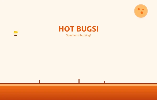 Bug Beach Day Heatwave
This playful animation brings sweltering summer insects to life with pure HTML and Tailwind CSS. Watch as: 🔥 Glowing Fireflies pulse with heat-radiant light, their wings shimmering in the desert sun 🐞 Overheated Ladybugs scuttle across cracked earth, their red shells reflecting the blazing heat ☀️ A Wobbling Sun dominates the sky, emitting pulsing heat waves across the animated landscape
9 months ago1.1k -
 2 years ago14.1k
 -
 1 year ago1.8k


Explore components by Tags
Didn't find component you were looking for?
Search from 3000+ components