Simple Responsive Navigation Bar w/Translation link
Minimal javascript - built using nested details element.
This tailwind example is contributed by Sherry Lynne, on 05-Aug-2026. Component is made with Tailwind v3.4. It is responsive.

Related Examples
-
 FinTech Banking Navbar with Trust Bar & Mobile Sidebar
A clean, enterprise-grade banking navigation bar built with pure HTML and Tailwind CSS. It features a trust announcement bar, responsive navigation, loan dropdown, secure call-to-action buttons, and a mobile sidebar. Perfect for fintech platforms, digital banks, insurance providers, investment firms, lending platforms, and financial service websites.
373 -
-
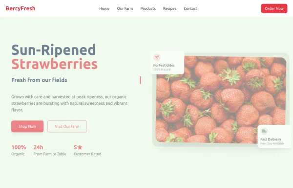 strawbery
by salvator
1.9k -
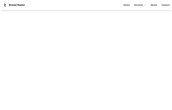 Tailwind CSS Navbar
Logo on the left. Main menu with a mega menu under "Services". Responsive design with a hamburger menu for mobile devices. Mega menu appears on hover for desktop and toggles on click for mobile.
2k -
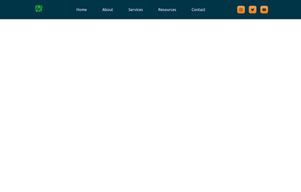 Nav Bar
Animated Mobile Dropdown menu
3.1k -
 Modern SaaS Agency Landing Page with Dark Mode & Mobile MenuE-Com With nav and filter
A premium SaaS agency landing page built with HTML, Tailwind CSS, and JavaScript. It features a sticky glassmorphism navbar, responsive mobile navigation drawer, light/dark mode toggle, animated hero section, case studies, services, process timeline, testimonial, FAQ accordion, booking CTA, and a clean modern footer. Perfect for startups, AI products, software agencies, creative studios, and digital businesses.
410 -
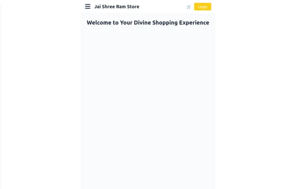 Responsive eCommerce Sidebar Layout with Hamburger Menu | Tailwind CSS UI for Online Stores
Build a clean and responsive eCommerce sidebar layout with a smooth hamburger menu using Tailwind CSS and Alpine.js. Ideal for devotional, spiritual, or modern online stores. Includes dark mode support, navigation links, cart, login, and a dynamic layout for beautiful product pages.
1.6k -
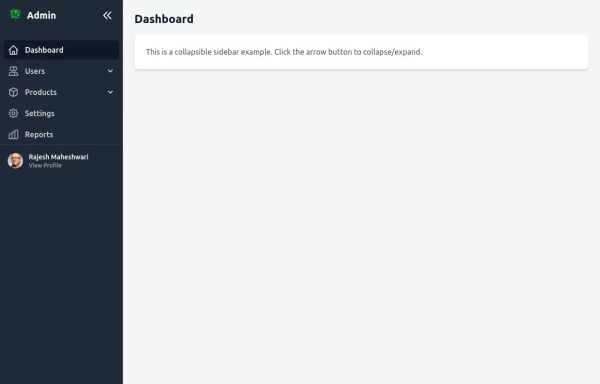
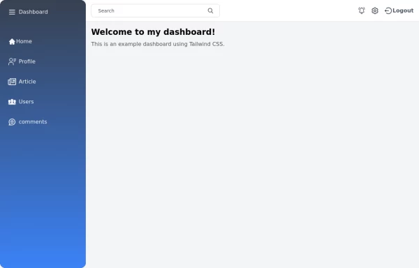 Tailwind Sidebar Layout
Place edited for the search button
-
 Navbar
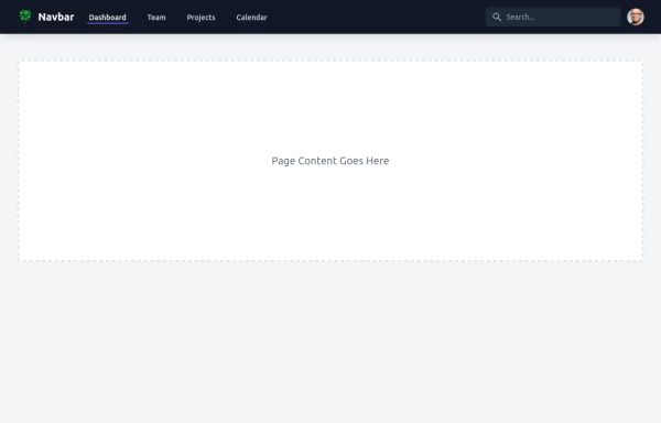
This navbar implementation includes: 1. Responsive design that works on both desktop and mobile 2. Indigo-800 and Blue-900 color scheme for the background and accents 3. Dark mode support with a toggle button 4. Beautiful animations and effects: 1. Fade-in animation for menu items with staggered delays 2. Hover effects on menu items with underline animation 3. Smooth color transitions 4. Mobile menu slide-down animation 5. SVG icons for the dark mode toggle and mobile menu button 6. "Sign Up" call-to-action button 7. Mobile-friendly dropdown menu 8. Accessibility considerations (proper heading structure, color contrast, focus styles) Key features: - The background uses a gradient from Indigo-800 to Blue-900 - The navbar has a white background in light mode and dark gray in dark mode - Text colors are adjusted for readability in both light and dark modes - Menu items have hover effects with color changes and underline animations - The dark mode toggle changes its icon based on the current mode - The mobile menu slides down with a smooth animation when toggled - Desktop menu items fade in with a staggered delay for a smooth entrance - Dark mode is automatically applied based on system preferences - The layout is responsive, with a hamburger menu for mobile screens This implementation provides a visually appealing and functional navbar with various animations and effects, using HTML, Tailwind CSS, and vanilla JavaScript for the interactions.
5.3k -
-
 Creative Agency Navbar with Fullscreen Mobile Menu & Animated CTA
A bold, editorial-style navigation bar designed for creative agencies, design studios, architecture firms, and portfolio websites. Built with pure HTML and Tailwind CSS, it features a minimalist branding system, fullscreen mobile navigation, animated call-to-action button, responsive layout, and modern typography inspired by premium digital agencies.
326 -
 28.7k







Browse by topic
Explore components by Tags
Jump straight to the UI pattern you need.
Can't find it?
Didn't find the component you were looking for?
Search across 3,000+ community-built components and grab the code in seconds.