Simple Responsive Navigation Bar
Minimal javascript - built using nested details element.
This tailwind example is contributed by Sherry Lynne, on 03-Aug-2026. Component is made with Tailwind v3.4. It is responsive.

Related Examples
-
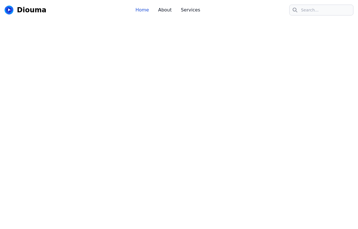 Navbar with search
Use this example of a navbar element to also show a search input element that you can integrate for a site-wide search.
-

-
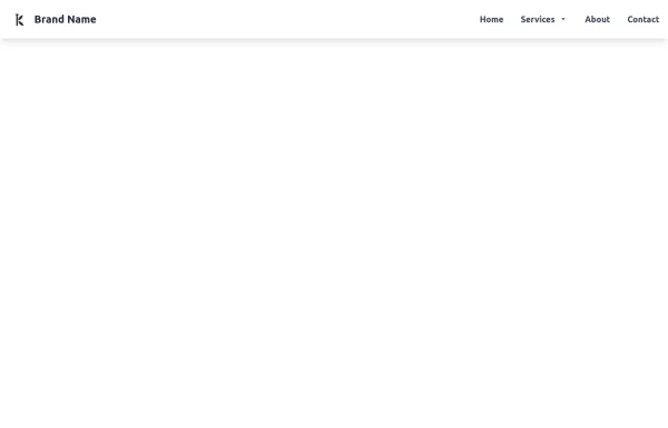 Tailwind CSS Navbar
Logo on the left. Main menu with a mega menu under "Services". Responsive design with a hamburger menu for mobile devices. Mega menu appears on hover for desktop and toggles on click for mobile.
2k -
 Responsive Tailwind CSS Navbar
A clean and professional navigation bar built with Tailwind CSS. This component includes a logo, navigation links, and a mobile menu with a toggle button for smaller screens. Fully responsive and easy to integrate into any project. Ideal for portfolios, business websites, or modern web apps.
1.4k -
 flower
by salvator
1.9k -
 Repsonsive Navbar
fully respondive navbar
582 -
 Production-Ready Responsive Navigation
This is a sample content area. Scroll down to see the fixed header in action.
4.3k -
 Ecommerce Navbar with products, Expanding Search & Mobile sidebar filter
luxury ecommerce navigation bar crafted with pure HTML and Tailwind CSS.
241 -
 hero modern
841 -
 material ios navbar mobile apple endroid
574 -
 Life Tree
by salvator
1.4k -
 Simple Responsive Navigation Bar w/Translation link
Minimal javascript - built using nested details element.
137






Browse by topic
Explore components by Tags
Jump straight to the UI pattern you need.
Can't find it?
Didn't find the component you were looking for?
Search across 3,000+ community-built components and grab the code in seconds.