Github star button
This tailwind example is contributed by Simon Scheffer, on 14-Dec-2022. Component is made with Tailwind v3.4.

Related Examples
-
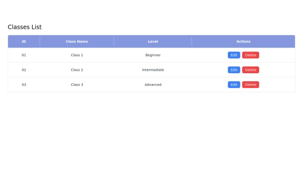 Responsive Classes List Table with Edit and Delete buttons using Tailwind CSS
This responsive classes list table is built using Tailwind CSS and features: - A clean layout with a header displaying column titles. - Action buttons for editing and deleting entries. - Responsive design that adapts to various screen sizes. - Easy customization options to fit your project's needs.
4.1k -
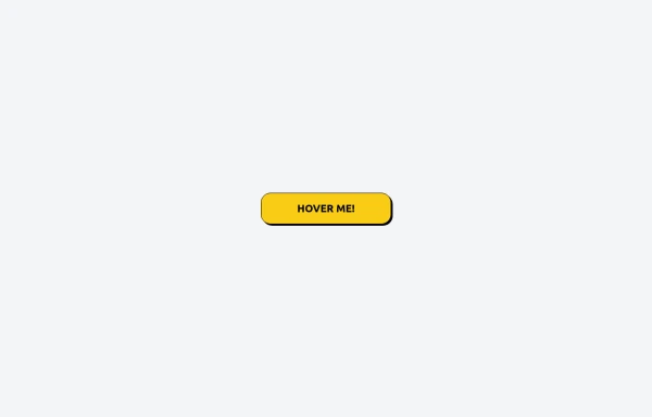 Tailwind CSS Button (Wavy Button)
The button uses Tailwind classes for size, background, border, border-radius, shadow, cursor, overflow, and transitions. The wave overlay is absolutely positioned at the bottom of the button, initially off-screen (top-full) and moves to the middle (top-1/2) on hover via the custom .wave class and keyframes. The font-poppins class isn’t a default Tailwind class. You should define it in your Tailwind configuration or replace it with font-sans if you haven't extended fonts.
1.4k -
 Button
628 -
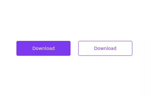 Primary and secondary button pair
Call to action buttons
18.1k -
 Image Card
An image. Shows title and description info when hovering. Image zooms and darkens when hovering.
1.2k -
 Get the app section
Play store and App store buttons
10.2k -
-
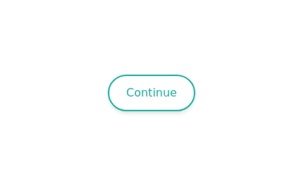 Animated Button
on hover show icon
3.3k -
-
20.2k
-

-
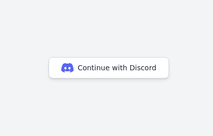 Continue with Discord button
Login with the Discord button for social login
13.8k







Browse by topic
Explore components by Tags
Jump straight to the UI pattern you need.
Can't find it?
Didn't find the component you were looking for?
Search across 3,000+ community-built components and grab the code in seconds.