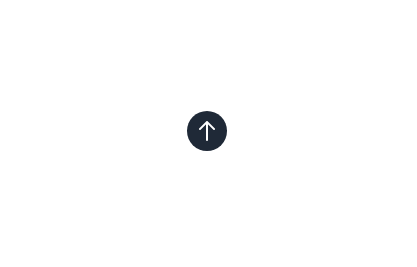
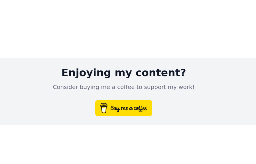
Buy me a coffee floating button
This tailwind example is contributed by Ron Hicks, on 23-Mar-2023. Component is made with Tailwind CSS v3.

Author Ron Hicks
Related Examples
-
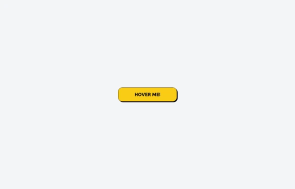
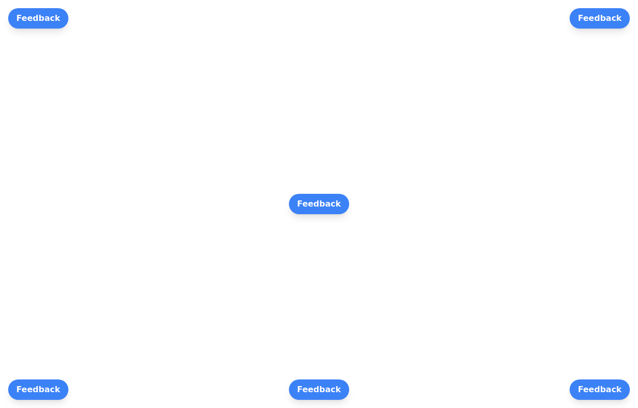 Floating buttons examples
Bottom-Right Corner, Bottom-Left Corner, Top-Left Corner, Top-Right Corner, Center, Bottom-Center
2 years ago25.8k -
 3 years ago12.7k
 -
Glowing gradient button
Button on black background
3 years ago39.5k -
 2 years ago16.7k
 -
 3 years ago15.4k
 -
 3 years ago16.5k
 -
Gradient Button
These buttons use a style that includes two contrasted colors creating an impressive mesh gradient effect.
1 year ago4.4k -
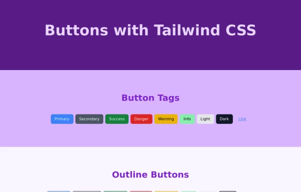 Tailwind Different Button Styles
Fully Responsive Buttons
1 year ago2.3k -
 3 years ago10.1k
 -

-
 Tailwind CSS Button (Wavy Button)
The button uses Tailwind classes for size, background, border, border-radius, shadow, cursor, overflow, and transitions. The wave overlay is absolutely positioned at the bottom of the button, initially off-screen (top-full) and moves to the middle (top-1/2) on hover via the custom .wave class and keyframes. The font-poppins class isn’t a default Tailwind class. You should define it in your Tailwind configuration or replace it with font-sans if you haven't extended fonts.
8 months ago953 -
 11 months ago2.3k


Explore components by Tags
Didn't find component you were looking for?
Search from 3000+ components