Responsive eCommerce Footer Component with Tailwind CSS
A modern, fully responsive eCommerce footer component built with Tailwind CSS. It includes multiple sections like company info, account links, help center, categories, social media icons, payment methods, and app download buttons. Optimized for seamless mobile and desktop experiences, making it perfect for any online store or business website.
This tailwind example is contributed by SHARIFUL ISLAM, on 22-Feb-2025. Component is made with Tailwind CSS v3. It is responsive. similar terms for this example is Front page

Author SHARIFUL ISLAM
Related Examples
-
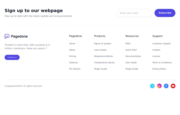 Pre-footer Newsletter
Use this example with a Newsletter section before the footer, a sitemap, the logo of your brand and social media accounts.
1 year ago2.9k -
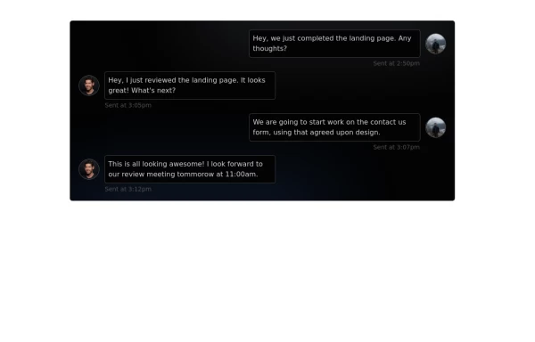 Chat Box for Marketing
An Onyx component. This chat box is great for SAAS landing pages where you want to mock customer interactions or expectations.
1 year ago2k -
 Footer for blog
https://github.com/tailwindow/component
3 years ago18.6k -
 1 year ago5k
 -
 Sidebar
This is the sidebar that I use in my projects, I use grid to be able to manage the space issue a little better, it seems like a clean and modern design, it is more than anything for the dashboards that you want to create
1 year ago4k -
 SomaRwanda
Menya uburyo bwo kwandika ibisomwa, impuzandimi, n'imyandikire y'icyongereza mu buryo bworoshye.
9 months ago1.1k -
 Pricing cards
pricing section with 3 cards
3 years ago12k -
 Animated Coming Soon Page 1
animated coming soon landing page
1 year ago4.2k -
 2 months ago407
 -
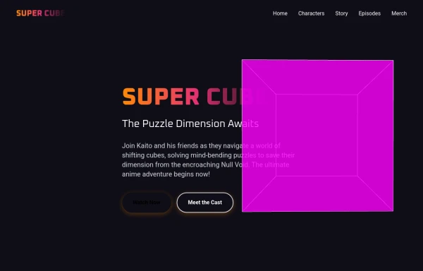 super cube
complex landing page for super cube created by salvator
10 months ago1k -
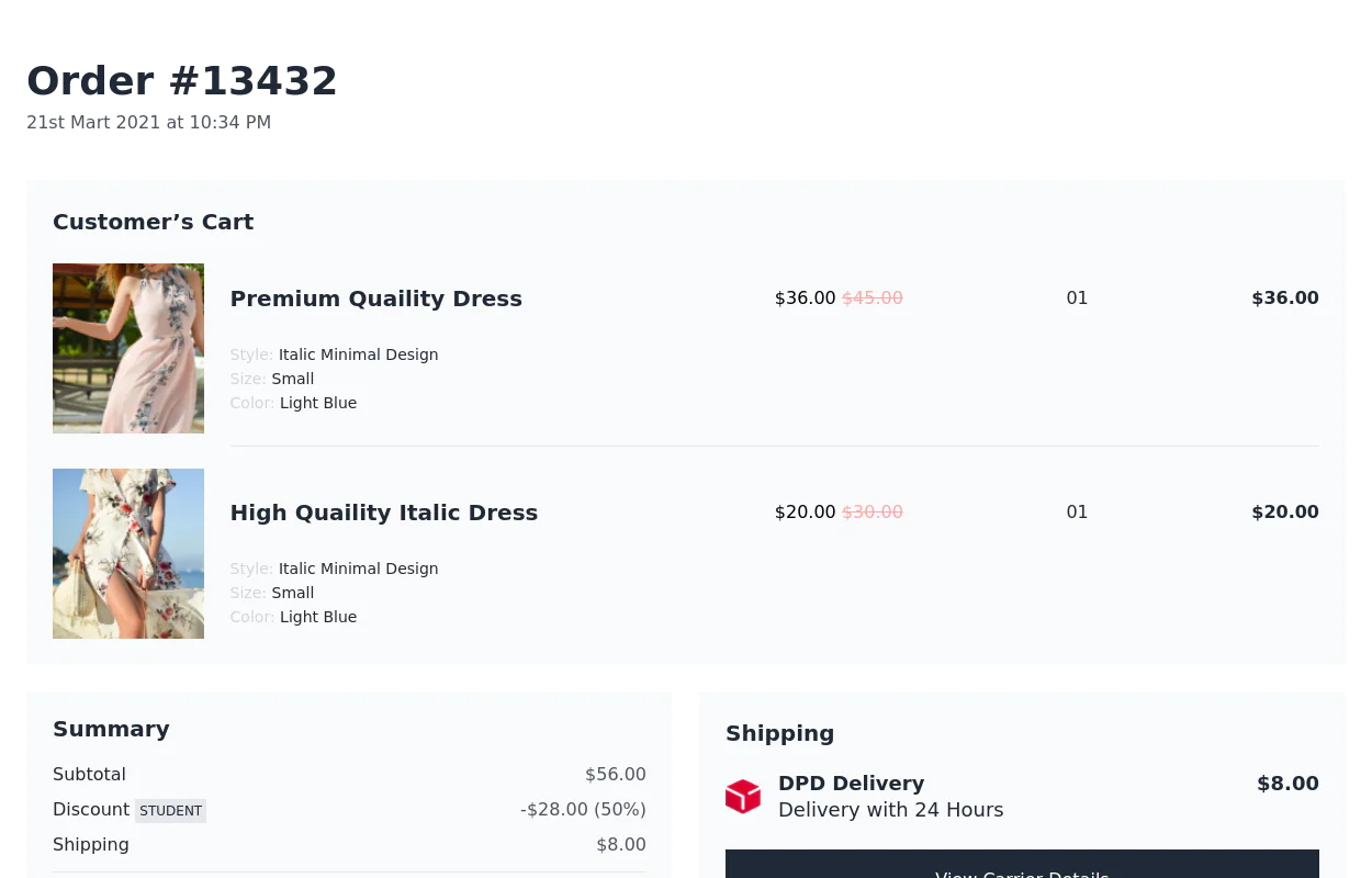 Order Sumamary
Shows the summary of the order a user has placed, may include shipping address, total amount, payment method, and status.
2 years ago14.2k -
 Premium High-Performance Web Gaming Hub
Experience the future of browser-based gaming. I’ve developed a premium arcade hub designed for speed, clarity, and zero-latency gameplay. Built with modern web technologies, Ayyamperumal Games brings AAA-inspired visuals and high-octane mechanics directly to your browser—no downloads, no lag, just pure performance. Explore a curated library of titles ranging from minimalist logic puzzles like Sudoku Elite to fast-paced action in Neon Drift. This is where clean code meets high-level entertainment.
2 months ago407


Explore components by Tags
Didn't find component you were looking for?
Search from 3000+ components