Hover effect card
This tailwind example is contributed by Samuel Dawson, on 29-Jan-2023. Component is made with Tailwind CSS v3. It is responsive.

Author Samuel Dawson
Related Examples
-
 3 years ago25.7k
 -
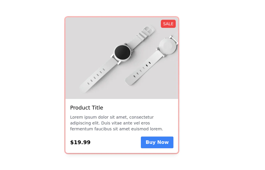
 Products card grid
Example of product card grid with product image and pricing
3 years ago24.2k -
 2 years ago17.4k
 -
 Responsive Card Grid
Tailwind CSS responsive grid for feature listing. The cards have a teal background, rounded corners, and a concise display of feature titles, descriptions, and a "Learn More" link.
3 years ago52.4k -
 3 years ago32.1k
 -
 3 years ago23k
 -
 3 years ago32.8k
 -
 User Profile Card
The card features a user's profile picture, name, location, and options for interactions. It has a clean and modern design with rounded edges and icons for user engagement. It also has support for dark mod:
3 years ago64.5k -
 3 years ago13.8k
 -
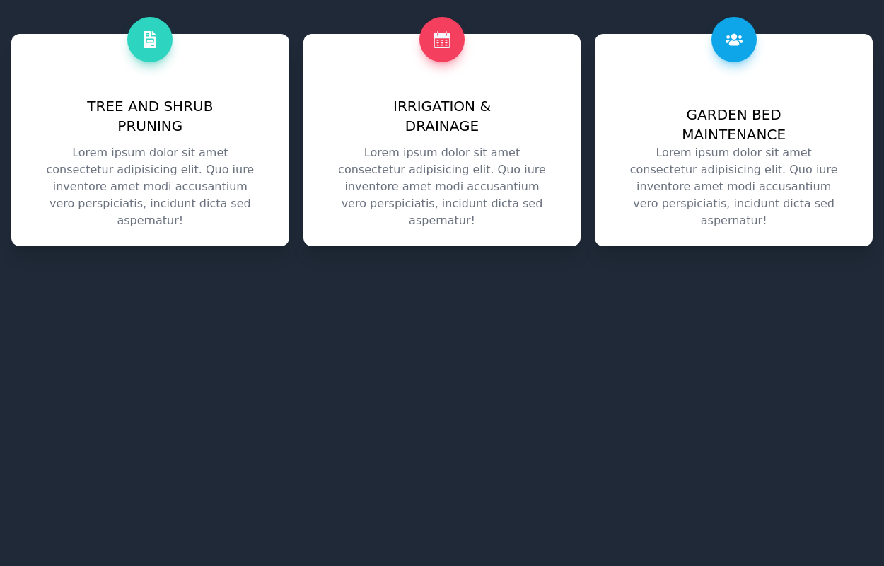
 Features cards section
Features cards section with dark theme
3 years ago10.6k -
 Admin dashboard cards
Card groups for showing stats/info.
3 years ago21.6k -
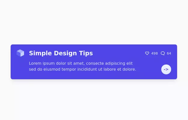
Group hover card
article card
3 years ago11.7k -
 3 years ago14k
 -
 3 years ago17.6k
 -
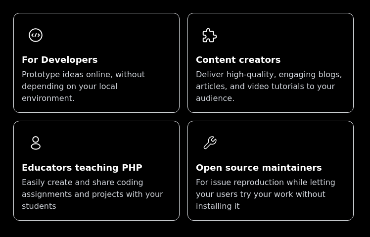
 Info Card
info card with description
3 years ago13k -
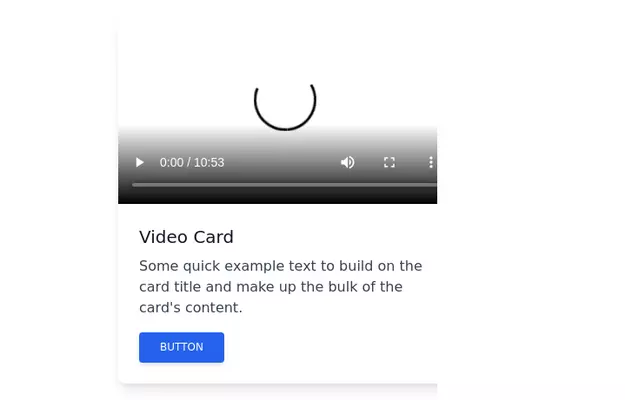 Video card
Video card component for tailwind css
3 years ago17.8k -
 Responsive card grid
responsive card grid for articles
3 years ago16k -
 Blog post cards
responsive blog post cards
3 years ago12.8k


Explore components by Tags
Didn't find component you were looking for?
Search from 3000+ components