Basic responsive card grid
supports dark mode
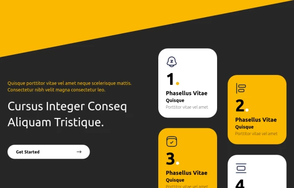
This tailwind example is contributed by Samuel Dawson, on 07-Feb-2023. Component is made with Tailwind CSS v3. It is responsive. It supports dark mode.

Author Samuel Dawson
Related Examples
-
 3 years ago11.1k
 -
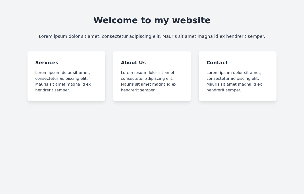
 Responsive Card Grid
Tailwind CSS responsive grid for feature listing. The cards have a teal background, rounded corners, and a concise display of feature titles, descriptions, and a "Learn More" link.
3 years ago52.2k -
 3 years ago15.5k
 -
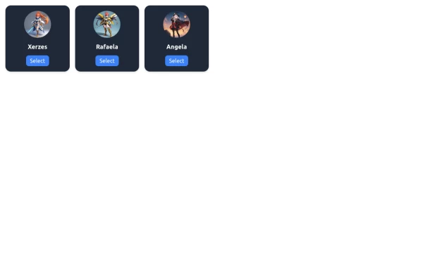 Game Character Cards
Simple game character cards selection
1 year ago1.5k -
 10 months ago915
 -
 pile carde scroll
pile carde scroll
1 month ago33 -
 3 years ago10.3k
 -
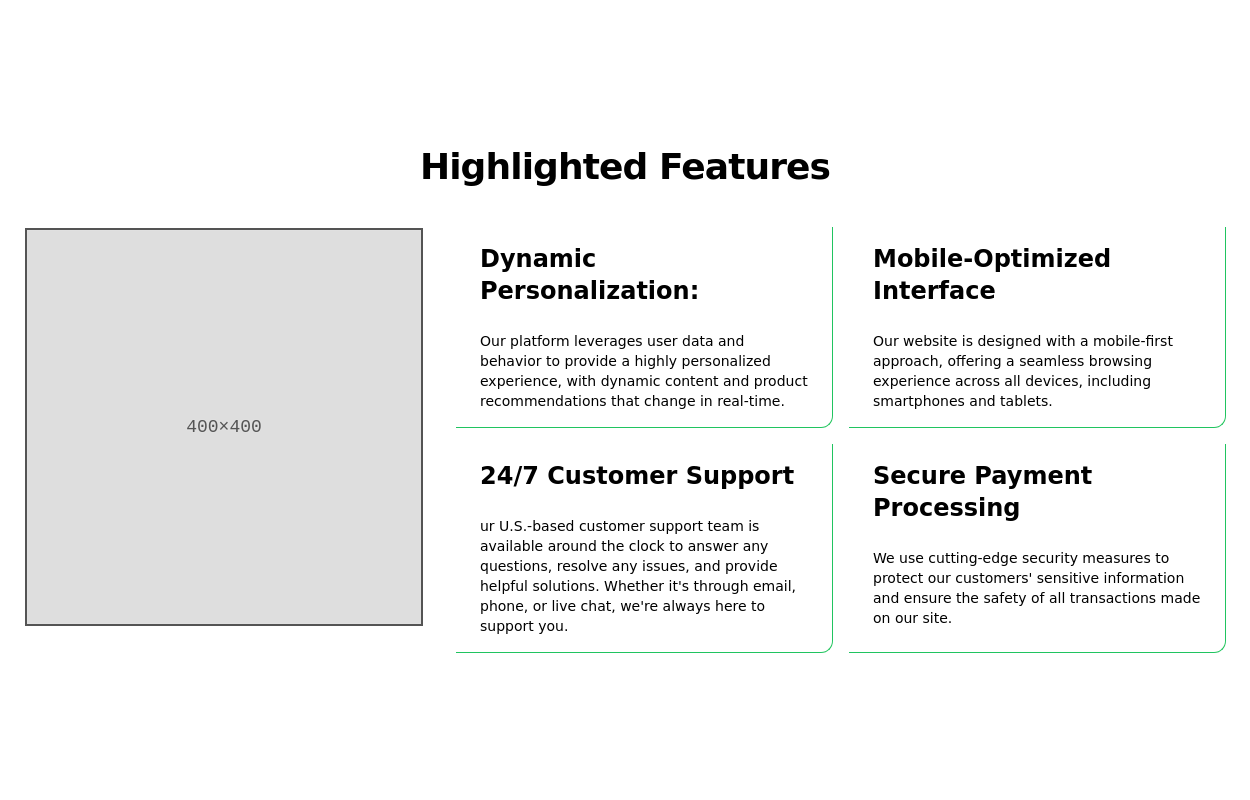
 Feature Showcase + Cards
Responsive section with cards aligned using grid layout.
1 year ago2.4k -
 4 months ago431
 -
 About Us
This The About Us Component with the tailwind class and some animation by tailwind and best about us page you can modify it and content is for now only clinic but you can ad your content
1 year ago4.9k -
 bears/beats/battlestar gallactica
bears beats battlestar gallactica
2 years ago9.7k -
 Enhanced Student Testimonials Section
A modern, interactive testimonials section featuring glassmorphism design, floating animations, and social proof elements. Includes star ratings, course badges, user profiles with online status indicators, and a stats section. Built with Tailwind CSS and features gradient backgrounds, hover effects, and responsive design optimized for showcasing student success stories and building credibility.
6 months ago644


Explore components by Tags
Didn't find component you were looking for?
Search from 3000+ components