Simple Footer 3
This tailwind example is contributed by $@(\/)(\/)¥, on 17-Nov-2024. Component is made with Tailwind CSS v3. It is responsive. similar terms for this example are Email campaign,Article Card, Blog page card, Article card

Author $@(\/)(\/)¥
Related Examples
-
 1 year ago2.1k
 -
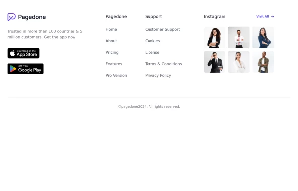
 Modern Dark Footer with Overlapping Gradient CTA
A comprehensive, dark-themed website footer component built with HTML and Tailwind CSS. It features a visually distinct overlapping section with a colorful gradient background containing a prominent call-to-action (CTA) block. The main footer area utilizes a multi-column grid layout for organized navigation links, a newsletter signup form, and social media icons. A final bottom bar includes legal links and copyright information. The design is responsive and adapts its layout for different screen sizes.
11 months ago1.1k -
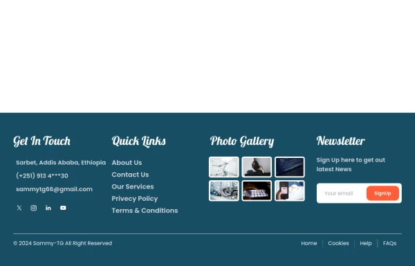
 Footer with gallery
Use this example if you want to add gallery of images into your footer with brand logo, sitemap links and copyright notice.
1 year ago2.6k -
 YouTube Community Post UI Mockup
A static HTML and Tailwind CSS component mimicking the user interface of a YouTube Community Post. This mockup features the channel header (avatar, name, verified badge, timestamp), post content (text and optional media), engagement actions (Like, Dislike, Comment, Share with counts), and the 'Add a comment' section. It's designed to be responsive, supports YouTube's light and dark themes via custom styling, and uses accurate iconography.
11 months ago1.2k -
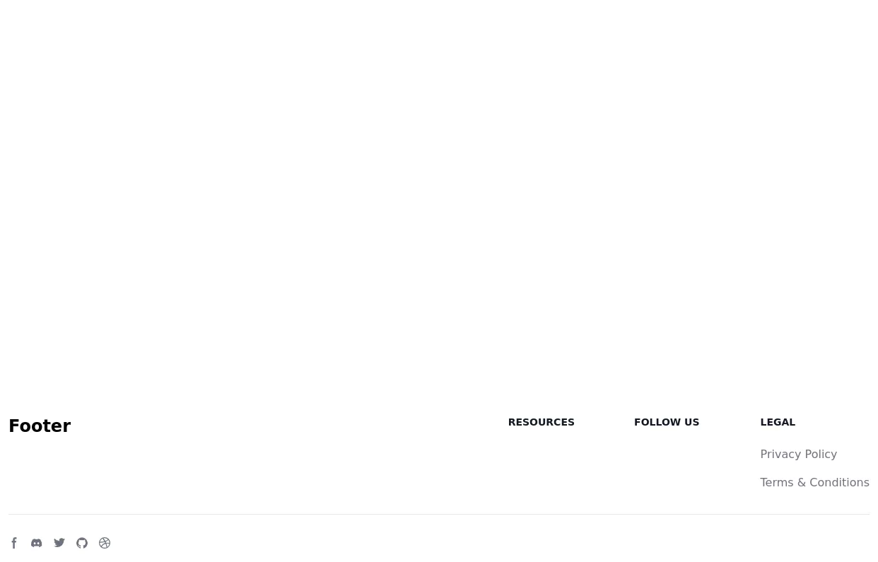
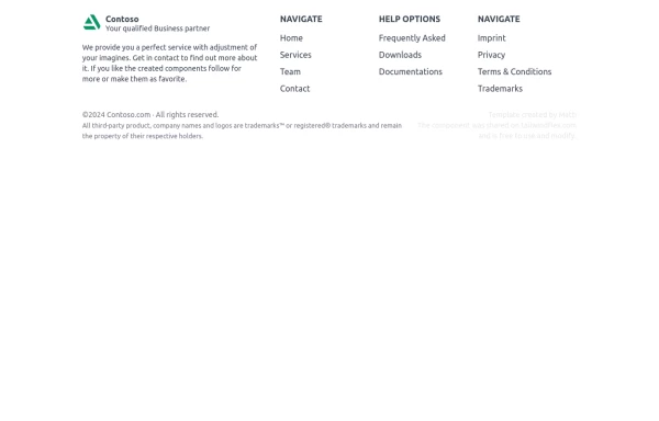 Footer
A simple footer with link adjustment for smartphones
1 year ago1.5k -
 Blog section - Htmlwind
Three columns blog section
9 months ago866 -
 2 months ago116
 -
 cards
cardshtml , css ,
10 months ago961 -
 1 year ago1.3k
 -
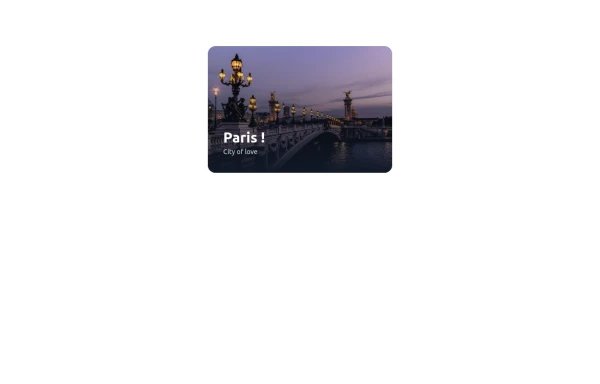
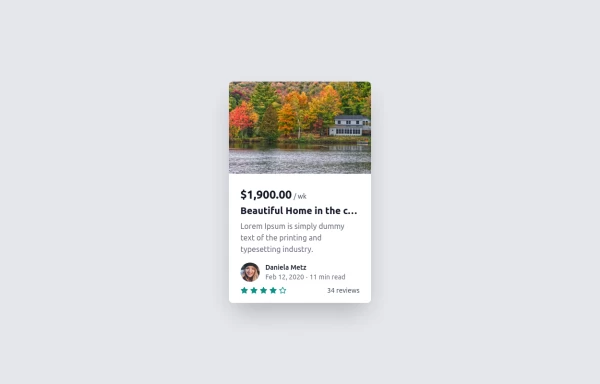 Card
Cardtravel place card hover effect card
1 year ago2.1k -
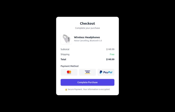 Checkout Card
A modern and responsive checkout card built with HTML & Tailwind CSS, featuring a clean UI, smooth shadows, and interactive hover effects. It includes secure payment options, a clear pricing breakdown, and adapts seamlessly to all screen sizes. Perfect for e-commerce and digital platforms to enhance user experience.
1 year ago1.5k -
 1 year ago3.5k


Explore components by Tags
Didn't find component you were looking for?
Search from 3000+ components