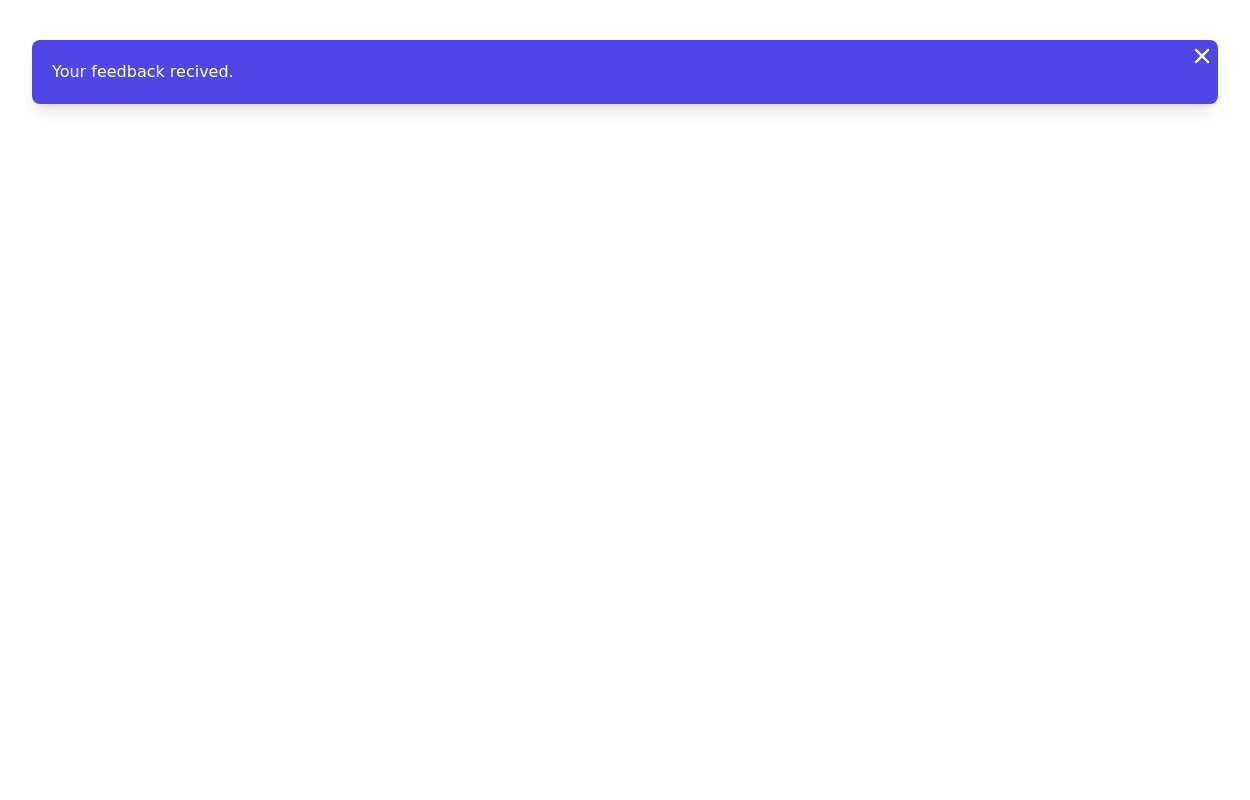
Animated Notification
This tailwind example is contributed by $@(\/)(\/)¥, on 15-Jan-2025. Component is made with Tailwind CSS v3. It is responsive. It supports dark mode. similar terms for this example are Toast, Snackbar

Author $@(\/)(\/)¥
Related Examples
-
 Notification
Dev Community Notification Clone
1 year ago3k -
 2 years ago10k
 -
 11 months ago934
 -
 vscode a la omerlinks
vscode a la omerlinks
2 months ago135 -
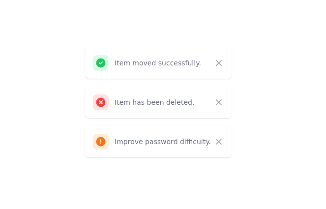
 Notification alert section
Show info, success, or error messages
3 years ago10.8k -
 1 year ago992
 -
 3 years ago12.3k
 -
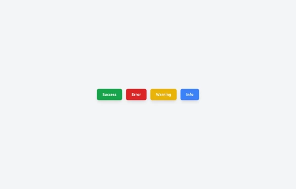
 Toast
Toastmensajes de alerta a los visitantes de su sitio web.
2 years ago16k -
 Scooby’s Hello – A Tailwind CSS Cartoon Animation
A playful animation built with Tailwind CSS and minimal custom CSS, featuring a cartoon-style Scooby-inspired dog sliding in from the left, wagging its tail, and cheerfully saying "Hello!"—perfect for adding personality to a fun web project.
8 months ago607 -
 Toast Notifications
Visually appealing toast notification component designed with Tailwind CSS
11 months ago1.2k -
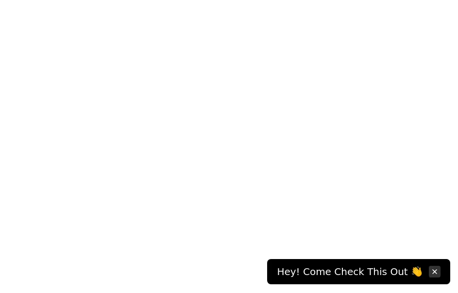 Floating dismissible notification
bottom right floating alert
3 years ago13.6k -
 3 years ago10.6k


Explore components by Tags
Didn't find component you were looking for?
Search from 3000+ components