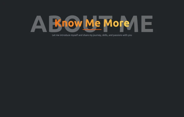
Sleek & Modern Tailwind CSS Card with Vibrant Gradient
✔ Vibrant Gradient Background 🎨
✔ Soft Shadows & Hover Scaling ✨
✔ Dark Mode Friendly 🌙
✔ Minimalist & Clean UI 💎
This tailwind example is contributed by Sachin Kannaujiya, on 03-Feb-2025. Component is made with Tailwind v3.4. It is responsive. It supports dark mode. similar terms for this example is about me

Related Examples
-
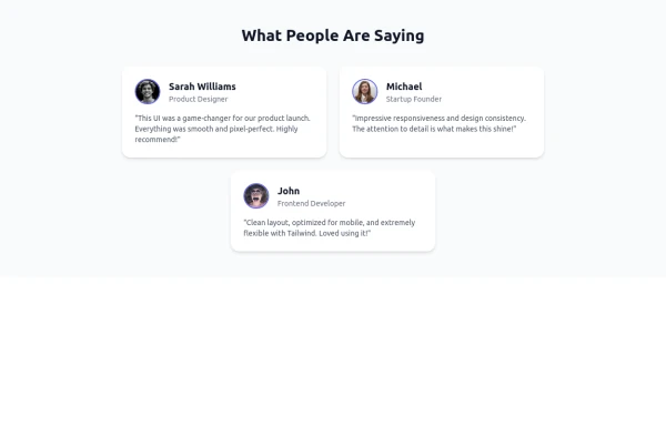 Tailwind Flex Component: Responsive Testimonial Section UI
A clean, modern, and fully responsive Testimonial Section built using Tailwind CSS and Flexbox. Ideal for portfolios, agency websites, SaaS landing pages, or any modern UI project. This reusable component includes user images, job titles, and quotes—perfect for showcasing feedback and adding trust to your UI.
-
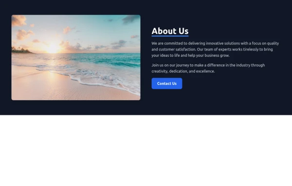
 Responsive About Section with Tailwind CSS
Built a sleek and fully responsive About Section for my portfolio using Tailwind CSS! 🚀 Designed for smooth adaptability across all screen sizes with a modern and minimal aesthetic. Perfect for showcasing skills, experience, and a personal touch!
-
 About - UI Components
Add an About Section to your website or application using Tailwind CSS. These About Sections are easy to use and fully customizable according to your brand's design. These Tailwind UI components are ready to use and customizable.
-
-
 canvas fully covers
5.2k -
 The Free AI Tools Grid Section (210+ Tools, No Signup)
A responsive and SEO-optimized grid section showcasing over 210 free AI tools. Designed with Tailwind CSS, fully responsive, fast-loading, and built for high user engagement. No sign-up required, privacy-friendly, and optimized for performance and discoverability.https://www.thefreeaitools.com/
-
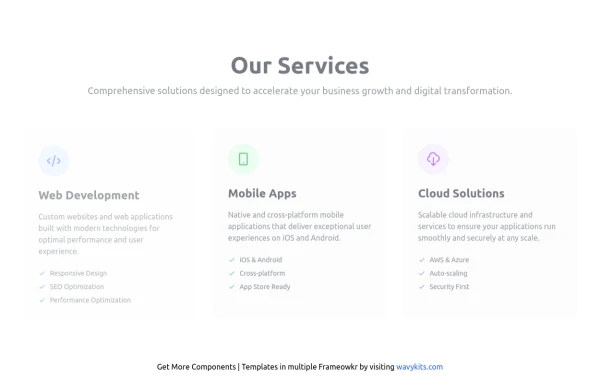 Our Services Section – Animated & Responsive
A modern and dynamic “Services” section built with Tailwind CSS and Alpine.js, designed to showcase your company’s main offerings with clean visuals and engaging animations. This component uses smooth fade and slide animations to reveal each service card as it comes into view. Each card highlights a core business area — Web Development, Mobile Apps, and Cloud Solutions — with beautiful hover effects, icons, and descriptive lists. Perfect for SaaS websites, agencies, and startups looking to present their services in a visually appealing, professional, and responsive layout. Key Features Smooth scroll-triggered animations with Alpine.js Responsive grid layout (mobile → desktop ready) Built with Tailwind CSS for fast customization Dark mode support included Interactive hover effects for each service card Ideal for corporate, SaaS, or portfolio websites 💡 Services Included 🌐 Web Development (Responsive, SEO-friendly, Optimized) 📱 Mobile Apps (Cross-platform, iOS & Android) ☁️ Cloud Solutions (AWS, Azure, Auto-scaling, Security)
1.5k -
 766
-
 portfolio
Complete Portfolio UI Kit with hero, about, skills, projects, testimonials, contact form, and footer. Fully responsive and dark mode supported using Tailwind CSS.
1.4k -
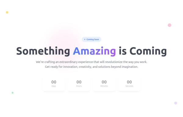 Coming Soon Countdown Section – Animated & Responsive
A beautifully designed "Coming Soon" landing section built with Tailwind CSS and Alpine.js, perfect for startups, SaaS platforms, and product launches. This component features a live countdown timer, smooth fade-in animations, and floating gradient effects for a futuristic, engaging look. The layout adapts seamlessly to all screen sizes and supports dark mode, creating a professional pre-launch experience that builds anticipation and excitement. ✨ Key Features ⏳ Dynamic countdown timer (days, hours, minutes, seconds) 🎨 Animated gradient orbs for a vibrant background effect 🌙 Dark mode support included 💨 Smooth entrance animations using Alpine.js 📱 Fully responsive design for all devices 🔗 Social media icons to keep your audience connected 💡 Perfect for: Coming Soon or Under Construction pages Product and SaaS pre-launch sites Portfolio or agency landing pages Event or app launch countdowns
1.4k -
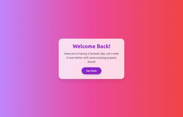 Boimator welcoming back
1.1k -
 Stylish Mobile-First Navigation Bar Using Tailwind
This project showcases a sleek, fixed-top responsive navigation bar crafted with Tailwind CSS. Featuring a vibrant gradient background, a bold uppercase logo, and smooth pink hover effects, it adapts beautifully across devices. On desktop, the navigation links appear horizontally with ample spacing, while on mobile, a hamburger menu toggles a stylish dropdown with rounded corners and subtle shadows. The navbar’s semi-transparent backdrop with blur adds a modern glassmorphism touch, making it perfect for contemporary web designs.
1.7k








Browse by topic
Explore components by Tags
Jump straight to the UI pattern you need.
Can't find it?
Didn't find the component you were looking for?
Search across 3,000+ community-built components and grab the code in seconds.