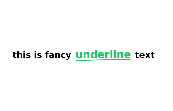
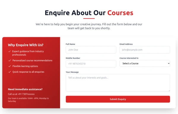
Heading Style
This tailwind example is contributed by KULDEEP, on 06-Jun-2025. Component is made with Tailwind CSS v3. It is responsive. similar terms for this example are Typography, Title, h1, h2, h3,about me

Author KULDEEP
Related Examples
-
 3 years ago12.6k
 -
 Modern Responsive Footer with Tailwind CSS
This sleek and modern responsive footer is built using HTML and Tailwind CSS. It features three sections: brand information, useful links, and social media icons. The footer includes smooth hover effects, subtle fade-in animations, and a fully responsive design that adapts seamlessly to different screen sizes. Perfect for websites looking for a professional and stylish footer section.
1 year ago2k -
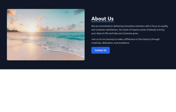
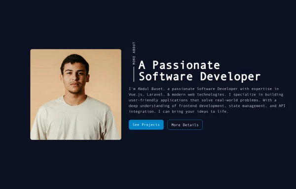 Responsive About Section with Tailwind CSS
Built a sleek and fully responsive About Section for my portfolio using Tailwind CSS! 🚀 Designed for smooth adaptability across all screen sizes with a modern and minimal aesthetic. Perfect for showcasing skills, experience, and a personal touch!
11 months ago1.5k -
 A Code Master Academy
A Code Master Academy – Empowering the Next Generation of Tech Leaders in Rwanda 👨💻 I'm Acode Master, the founder of A Code Master Academy, a practical and inclusive coding school based in Rubavu, Rwanda. The academy is dedicated to transforming lives by equipping unemployed youth and passionate learners with job-ready skills in modern software development.
8 months ago1.2k -
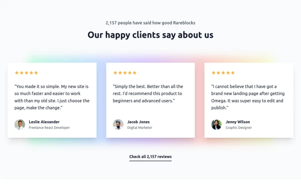
 portfolio
Complete Portfolio UI Kit with hero, about, skills, projects, testimonials, contact form, and footer. Fully responsive and dark mode supported using Tailwind CSS.
8 months ago836 -
 8 months ago871
 -
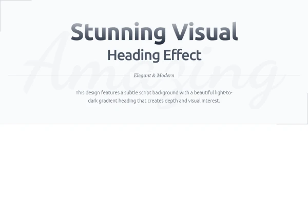 Heading
Subtle Script Background - Large, very light script font in the background ("Amazing") Light-to-Dark Gradient Heading - Main heading fades from light gray to dark gray Layered Typography - Secondary heading in medium weight for contrast Elegant Divider - With centered italic text Minimalist Border Accents - Thin borders in corners for sophistication Responsive Design - Scales beautifully on all devices
8 months ago705 -
 8 months ago1k
 -
 7 months ago1.3k
 -
 7 months ago1.3k
 -
 about video
about kelaplus video
7 months ago827 -
 Responsive Portfolio Webpage with Tailwind CSS
This is a reusable and responsive portfolio webpage template created with HTML and Tailwind CSS. Designed for developers or creatives, the template includes essential sections like Header, Hero, About, Skills, Experience, Projects, Testimonials, Contact Form, and Footer. It features a clean, modern design and is fully customizable without requiring JavaScript. Perfect for showcasing personal or professional work on the web.
1 year ago2.3k


Explore components by Tags
Didn't find component you were looking for?
Search from 3000+ components