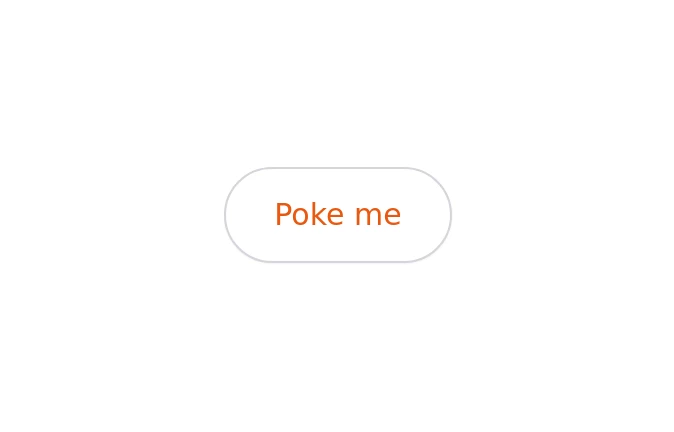
Tooltip
A modern tooltip component with a gradient action button and smooth hover animation. Built using Tailwind CSS and custom styles, it provides clear, accessible hints with a polished UI and responsive behavior.
This tailwind example is contributed by Rupesh, on 05-Jan-2026. Component is made with Tailwind CSS v3. It is responsive. It supports dark mode.

Author Rupesh
Related Examples
-
 Native tooltip
tooltip
1 year ago3.2k -
3 years ago10.2k
-
 1 year ago3.1k
 -
Popover
basic popover example
2 years ago13.1k -
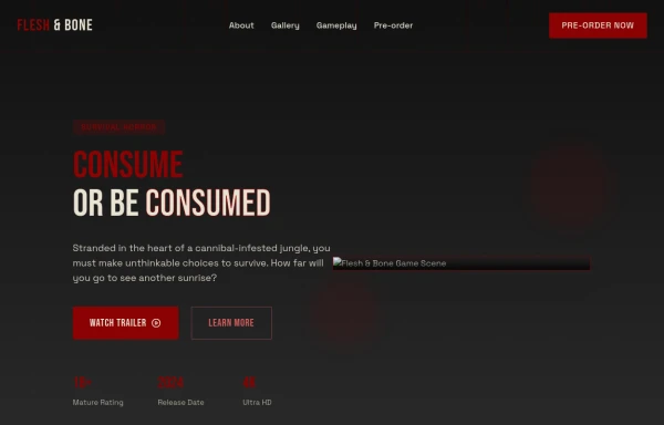 Game changer
by salvator
8 months ago836 -
 Card Component
This component is a simple card (without image) component with hover effect & Dark mode Supported & full responsive
1 year ago3.5k -
 Gradient Flip-Text Button with Hover Animation
This stylish button features a dynamic gradient background that shifts from a calm green gradient by default to a vibrant purple-pink-red gradient on hover. The button also includes an interactive text flip effect, where the text seamlessly transitions on hover, creating a visually appealing and modern UI element. Perfect for adding flair to your websites or applications while maintaining functionality and responsiveness.
1 year ago1.2k -
 Simple navbar
semi transparent
3 years ago14.1k -
 3 years ago11k
 -
 Simple Alret Modal
Minimal Modal
3 years ago12.1k -
 Gallery
Masonry Grid
1 year ago3.2k -
 3 years ago25.6k


Explore components by Tags
Didn't find component you were looking for?
Search from 3000+ components