Blog Card
A blog card with dark-mode
This tailwind example is contributed by Robert Chunga, on 09-Dec-2024. Component is made with Tailwind CSS v3. It supports dark mode.

Author Robert Chunga
Related Examples
-
 2 months ago125
 -
 Tour package card
This card could be used for featuring a product, service, or blog post:
1 year ago2.5k -
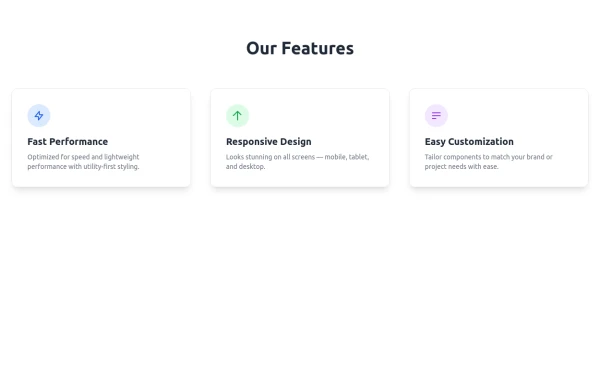 Features
A clean, responsive feature section with icons, smooth hover effects, soft backgrounds, and clear titles for modern website designs.
8 months ago692 -
 1 year ago1.9k
 -
 3 years ago11.1k
 -
 2 years ago4.5k
 -
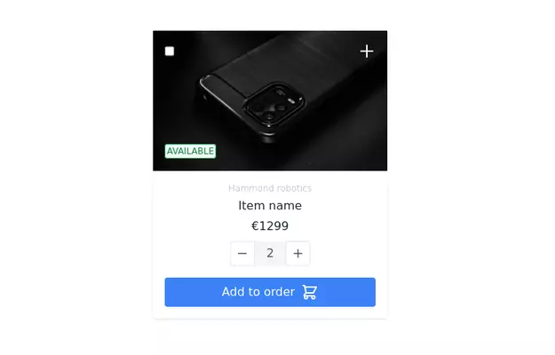
 Card Product
Card Product for List Product
2 months ago88 -
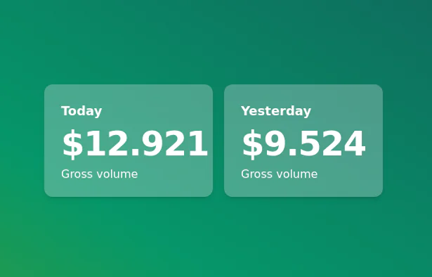
 Card KPI
Targetas ahora con un grafico
4 months ago693 -
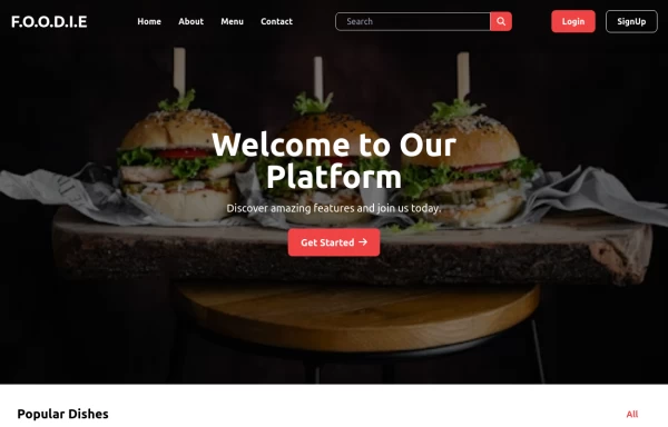
 The Future of Web Development
love my product
10 months ago911 -
 Ripple Animation
Component is made with Tailwind CSS v3. It is responsive. It supports dark mode. similar terms for this example are loading, loader,Author box, User information,Transitions
2 months ago387 -
 3 years ago12.9k
 -
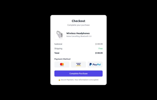 Checkout Card
A modern and responsive checkout card built with HTML & Tailwind CSS, featuring a clean UI, smooth shadows, and interactive hover effects. It includes secure payment options, a clear pricing breakdown, and adapts seamlessly to all screen sizes. Perfect for e-commerce and digital platforms to enhance user experience.
1 year ago1.5k


Explore components by Tags
Didn't find component you were looking for?
Search from 3000+ components