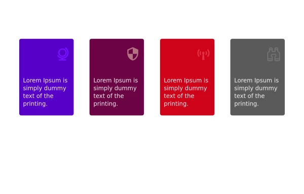
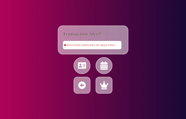
Material 3 Cards [Light]
Cards that conform to Google's Material 3 design guidelines and themes
This tailwind example is contributed by Nick Girga, on 24-May-2025. Component is made with Tailwind CSS v3.

Author Nick Girga
Related Examples
-
 1 year ago1.7k
 -
 Experience Card
Experience card section you can use for portfolio or other profiles.
2 years ago4.1k -
 Services
Card Services Section. find it makecomponents.com
1 year ago2.3k -
 1 year ago3.2k
 -
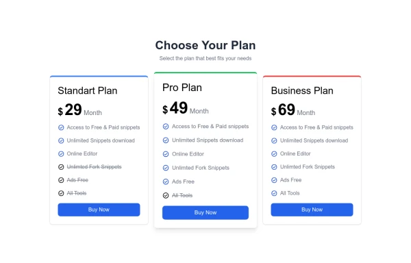 pricing card
This frontend template is designed for a website that provides software services and open-source code to users. It serves as a clean, modern UI for browsing, searching, and downloading open-source projects. Building with HTML, tailwindcss for CSS ,
6 months ago651 -
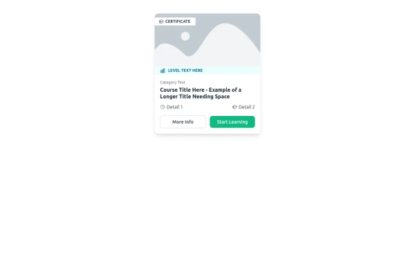 E-Learning Course Card with Badge and Level Indicator
An HTML and Tailwind CSS component mockup for displaying course information. Features include a placeholder image area with an overlaid certificate badge, a distinct level indicator banner below the image, category text, a course title, key details (like duration and learner count placeholders), and primary/secondary action buttons. Designed for e-learning platforms or course listings.
11 months ago1.1k -
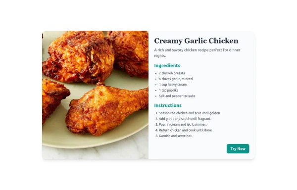 Recipe card
A modern and responsive Tailwind CSS recipe card with image, ingredients, and instructions. Supports dark mode and mobile view.
10 months ago1.1k -
 1 month ago153
 -

-
 alert
alerthtml , css
10 months ago1.3k -
 3 years ago23k
 -
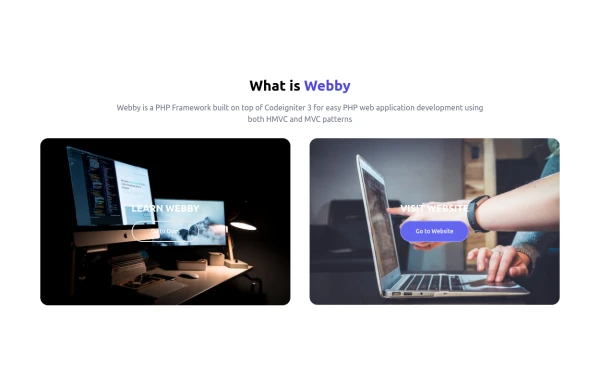 What is Webby
Webby is a PHP Framework built on top of Codeigniter 3 for easy PHP web application development using both HMVC and MVC patterns.
1 year ago2.3k


Explore components by Tags
Didn't find component you were looking for?
Search from 3000+ components