E-commerce cards
E-commerce responsive cards with dark mode
This tailwind example is contributed by Robert Chunga, on 23-Jun-2024. Component is made with Tailwind CSS v3. It is responsive. It supports dark mode.

Author Robert Chunga
Related Examples
-
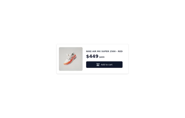 Card-Product
Product card for vertical windows, if you need a more complete version to show more information, you have other options in my profile
1 year ago2.8k -
 1 year ago1.3k
 -
 1 year ago2.1k
 -
 1 year ago1.9k
 -
 Login Form
A modern Tailwind CSS animated login form featuring smooth transitions, premium UI styling, responsive layout, and interactive input effects. Designed for admin panels, SaaS dashboards, and secure web applications, this login template delivers a clean light-theme interface with professional animations and a high-end user experience.
1 month ago96 -
 1 year ago1.2k
 -
 1 year ago2.8k
 -
 2 months ago161
 -
 Animated Ripple Avatar
Ripple Effect Avatar (Tailwind CSS Component) A visually striking animated component that displays a centered avatar or image surrounded by expanding ripple circles. Built with Tailwind CSS and custom animations, this effect simulates a pulsing or water ripple reaction, drawing attention to the central image. Ideal for user profile sections, hero banners, landing pages, or highlighted features in modern web interfaces. The ripples gradually fade and expand, creating a soft, calming motion that enhances interactivity and depth.
10 months ago1.3k -
 Card Component Simple
This is a Card Component for simple use &full responsive
2 years ago3k -
 9 months ago624
 -
 3D Card
Made a 3d card using tailwind css and the js
2 months ago266


Explore components by Tags
Didn't find component you were looking for?
Search from 3000+ components