Battery and signal
Battery and signal bar component
This tailwind example is contributed by ardianhu, on 27-Dec-2024. Component is made with Tailwind CSS v3. It is responsive.

Author ardianhu
Related Examples
-
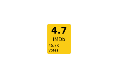 2 years ago8.8k
 -
 1 year ago6k
 -
 E-Learning Course Card with Badge and Level Indicator
An HTML and Tailwind CSS component mockup for displaying course information. Features include a placeholder image area with an overlaid certificate badge, a distinct level indicator banner below the image, category text, a course title, key details (like duration and learner count placeholders), and primary/secondary action buttons. Designed for e-learning platforms or course listings.
11 months ago1.1k -
 Code Editor UI
Simple code editor prototype made with HTML and TailwindCSS. A lightweight template to explore and customize.
6 months ago480 -
Profile Card
Show more details on hover
2 years ago14.7k -
 User Profile Card
Useful for testimonials and reviews section
3 years ago10.9k -
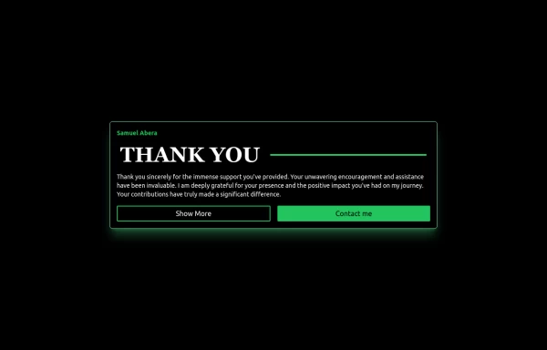
 1 year ago2.1k
 -
 Créer une story
Créer une story
3 months ago404 -
 Card
CardCard
1 year ago1.8k -
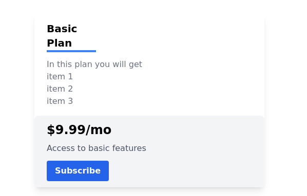 Pricing card
basic pricing card with single price
2 years ago10.9k -
 1 year ago7.1k
 -
 1 year ago1.5k


Explore components by Tags
Didn't find component you were looking for?
Search from 3000+ components