Elegant Cards
Useful Tailwind classes for creating several types of cards. Ranging from simple text to more complex cards with animations and video.
This tailwind example is contributed by Nick Girga, on 02-May-2025. Component is made with Tailwind CSS v3. It is responsive. It supports dark mode.

Author Nick Girga
Related Examples
-
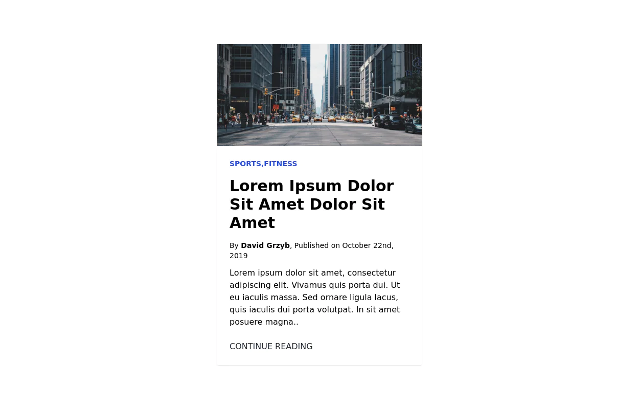
 Info card for admin panal
Show stats on your dashboard
3 years ago13.2k -
 3 years ago12.2k
 -
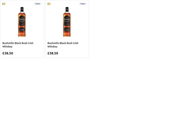 Product card for e-commerce
A responsive product card for e-commerce, displaying product image, country flag, volume, name, and price, with hover effects and a clean layout.
1 year ago1.5k -
 3 years ago9.9k
 -
 10 months ago1.6k
 -
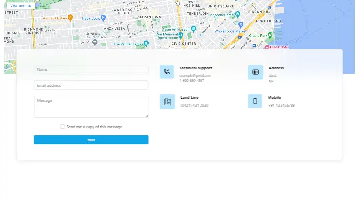 Contact us form with map
Contact us form with map
2 years ago12.4k -
 3 years ago12.7k
 -
 Card Component Simple
This is a Card Component for simple use &full responsive
2 years ago2.9k -
 Beautiful Info card
Info card with info type section on the corner.
3 years ago10.4k -
 3 years ago22.8k
 -
 Card
CardProfile Card
9 months ago1.1k -
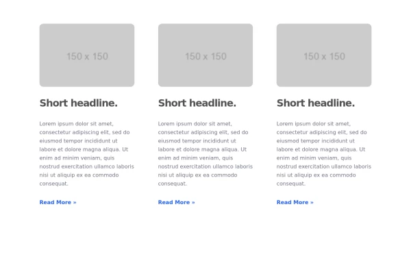
 Info Card
Information card with image
3 years ago9.8k


Explore components by Tags
Didn't find component you were looking for?
Search from 3000+ components