Product Carousel with Tailwind CSS, Swiper & Alpine.js
A modern, responsive product carousel built with Tailwind CSS, Swiper, and Alpine.js.
The component features smooth sliding animations, autoplay, and custom navigation controls.
Each product card uses a flexible Tailwind layout and includes dynamically generated demo images, making it easy to drop into any landing page, marketing site, or product showcase.
Ideal for showcasing products in a clean, lightweight, and highly customizable way.
This tailwind example is contributed by Juraj, on 24-Jan-2026. Component is made with Tailwind v3.4. It is responsive. similar terms for this example are Product Showcase, Product card

Related Examples
-
 837
837 -
 Nice and simple carousel
Nice and simple carousel, fully responsive.
4.6k -
 PrimeCorp | Professional Business Solutions
We deliver cutting-edge business solutions through strategic consulting, tailored services, and continuous support. Partner with us to optimize operations, drive growth, and achieve sustainable success in today's competitive market.
-
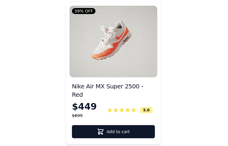 Card-Product
Item or card to show products
-
 8.1k
8.1k -

-
 1.3k
1.3k -
 Modern E-commerce Product Card with TailwindCSS
This product card is designed for e-commerce platforms using TailwindCSS. It features a discount badge, product image carousel, quick view and quick order buttons, ratings, product name, brand details, dynamic pricing with a strike-through original price, and a prominent add-to-cart button. The clean and professional layout is perfect for showcasing products on online stores.
2.8k -
 834
834 -
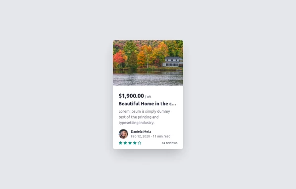 Card
Cardtravel place card hover effect card
2.5k -
 The Free AI Tools Grid Section (210+ Tools, No Signup)
A responsive and SEO-optimized grid section showcasing over 210 free AI tools. Designed with Tailwind CSS, fully responsive, fast-loading, and built for high user engagement. No sign-up required, privacy-friendly, and optimized for performance and discoverability.https://www.thefreeaitools.com/
-
 tinderclone By omerlinks
tinderclone By omerlinks
636





Browse by topic
Explore components by Tags
Jump straight to the UI pattern you need.
Can't find it?
Didn't find the component you were looking for?
Search across 3,000+ community-built components and grab the code in seconds.