3 columns blog section
de columnis, columni, 3 columns
This tailwind example is contributed by Anonymous, on 05-Dec-2023. Component is made with Tailwind CSS v3. It is responsive. similar terms for this example are Article Card, Blog page card, Article card

Author Anonymous
Related Examples
-
 Tailwind image slider
slider with navigation buttons and info about image
2 years ago20.6k -
 Carousel with Tailwind CSS and Alpine.js
Simple card Carousel
3 years ago31.5k -
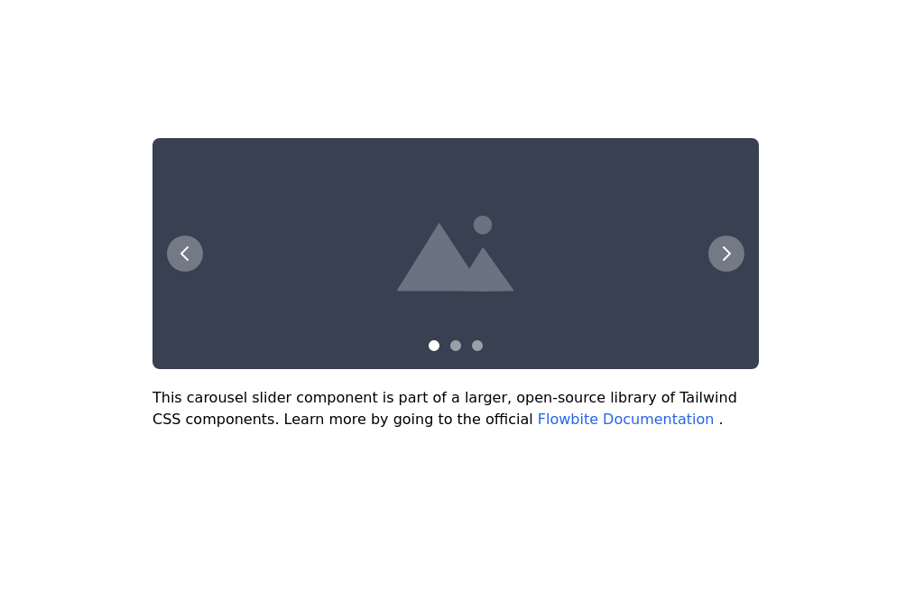 Image carousel
Uses Flowbite
2 years ago31.1k -
 Carousel Card Slider Swiper on Alpine.JS
with support drag and drop mouse actions
1 year ago13k -
 1 year ago6.8k
 -
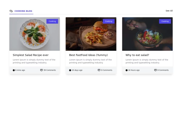 Card grid section
Display article/blog grid
2 years ago29.1k -
 10 months ago1.3k
 -
 1 year ago1.7k
 -
 Targeta
Targeta
1 month ago228 -
 2 years ago22.6k
 -
 Twitter Post (Tweet) UI Mockup
A detailed static HTML and Tailwind CSS component replicating the user interface of a single Twitter post (Tweet). This mockup includes the user avatar, tweet header (name, handle, timestamp), tweet text with styled hashtags/mentions, optional media display, and the action bar with icons and counts (Reply, Retweet, Like, Views, Share). It is responsive, supports light and dark modes, and uses accurate iconography and hover states to closely resemble the real Twitter UI.
8 months ago637 -
 2 years ago24k


Explore components by Tags
Didn't find component you were looking for?
Search from 3000+ components