Simple Animated Carousel
A simple, animated 2:1 carousel with touch swipe support, based on perky98/Juraj's carousel.
This tailwind example is contributed by Nick Girga, on 27-Apr-2025. Component is made with Tailwind v3.4. It is responsive. It supports dark mode.

Related Examples
-

-
 Premium High-Performance Web Gaming Hub
Experience the future of browser-based gaming. I’ve developed a premium arcade hub designed for speed, clarity, and zero-latency gameplay. Built with modern web technologies, Ayyamperumal Games brings AAA-inspired visuals and high-octane mechanics directly to your browser—no downloads, no lag, just pure performance. Explore a curated library of titles ranging from minimalist logic puzzles like Sudoku Elite to fast-paced action in Neon Drift. This is where clean code meets high-level entertainment.
971 -
 Product Carousel with Tailwind CSS, Swiper & Alpine.js
A modern, responsive product carousel built with Tailwind CSS, Swiper, and Alpine.js. The component features smooth sliding animations, autoplay, and custom navigation controls. Each product card uses a flexible Tailwind layout and includes dynamically generated demo images, making it easy to drop into any landing page, marketing site, or product showcase. Ideal for showcasing products in a clean, lightweight, and highly customizable way.
662 -
 3D Coverflow Slider — Ambient Background
A depth-based 3D slider with real perspective and rotateY transforms (not just fade), paired with a drifting polyhedra background that responds to cursor movement. Zero dependencies — pure Tailwind utilities, one config file, and vanilla JS. Auto-plays, pauses on hover, fully keyboard/dot-navigable. Swap the color tokens in the config to reskin it.
187 -
 Our services
Component: Interactive Services Carousel Overview: A card-based carousel built with HTML5 and Tailwind CSS, powered by Vanilla JavaScript. It displays Adeoar's 6 main services with a responsive layout and smooth transitions. Technical Features: Responsive: Displays 3 columns on desktop (md breakpoint) and 1 column on mobile devices. Dependencies: Tailwind CSS (CDN or compiled) + Native JavaScript (no external libraries like Swiper or Slick required). Icons: Inline SVG icons (Heroicons style). Functionalities: Navigation: Side buttons (prev/next) and bottom pagination (indicator dots). Automation: Autoplay runs every 4 seconds (infinite loop logic). Interaction: Autoplay pauses automatically on mouse hover (mouseenter/mouseleave). Style & Design (UX/UI): Default State: White background, soft shadows, pastel-colored icon backgrounds. Hover State (Active): Zoom Effect: The card scales up (scale-105). Color Inversion: Background changes to Navy Blue (bg-blue-900) and text turns white for high contrast. Details: The icon background turns white, and the icon stroke takes the dark blue color.
1.2k -
 Team Hero Section with Carousel
A clean and responsive hero section featuring an experts carousel built with Tailwind CSS, Swiper, and Alpine.js. The section highlights key experts with contact details and a clear call-to-action, making it ideal for landing pages and service-focused websites.
517 -
 Tailwind image slider
slider with navigation buttons and info about image
21.6k -

-
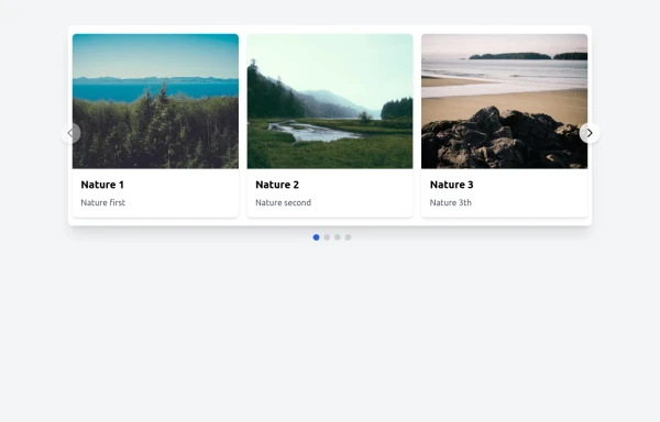 Responsive Image Carousel with Alpine.js
This component is a fully responsive image carousel/slider that displays: 1 slide at a time on mobile devices (screen width < 768px) 3 slides at a time on desktop (screen width ≥ 768px)
2.3k -
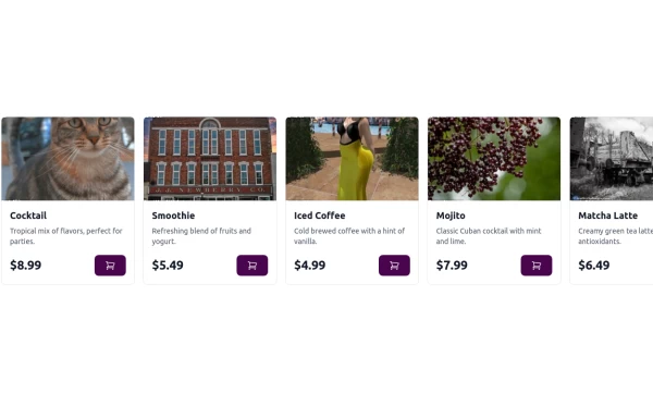 Carousel Card Slider Swiper on Alpine.JS
with support drag and drop mouse actions
14.2k -
 Responsive Image Carousel with Alpine.js
This component is a fully responsive image carousel/slider that displays: 1 slide at a time on mobile devices (screen width < 768px) 3 slides at a time on desktop (screen width ≥ 768px)
709 -
 tinderclone By omerlinks
tinderclone By omerlinks
637







Browse by topic
Explore components by Tags
Jump straight to the UI pattern you need.
Can't find it?
Didn't find the component you were looking for?
Search across 3,000+ community-built components and grab the code in seconds.