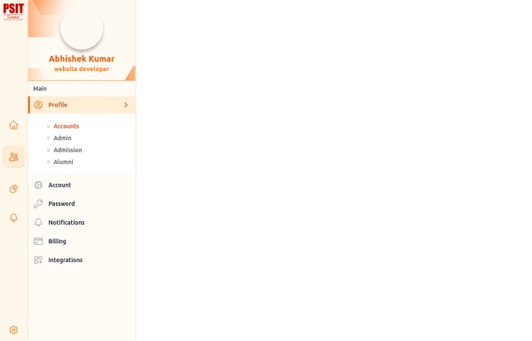
Material 3 Drawer (Responsive) [Light]
A sidebar drawer that conforms to Google's Material 3 design guidelines. Static sidebar when the screen is >=lg. Collapses into a drawer when the screen is <lg.
This tailwind example is contributed by Nick Girga, on 26-May-2025. Component is made with Tailwind CSS v3. It is responsive. similar terms for this example is drawer

Author Nick Girga
Related Examples
-
 5 months ago782
 -
 1 year ago1.9k
 -
 Responsive navbar with alpinejs
A mix of Penguin navbar with PineUI Slide-Over
1 year ago3.3k -
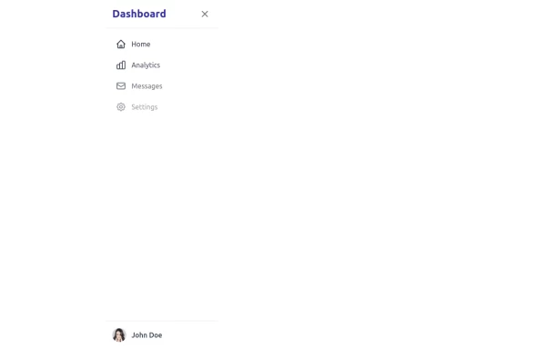 sidebar
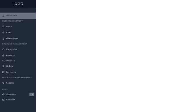
This sidebar implementation includes: 1. Responsive design that works on both desktop and mobile 2. Indigo-800 and Blue-900 color scheme for the background 3. Dark mode support 4. Beautiful animations and effects: 1. Slide-in animation when opening the sidebar 2. Fade-in animation for menu items with staggered delays 3. Hover effects on menu items with underline animation 4. Smooth color transitions 5. SVG icons for menu items 6. User profile section at the bottom of the sidebar 7. Close button for easy dismissal on mobile 8. Main content area with a toggle button for the sidebar 9. Accessibility considerations (proper heading structure, color contrast, focus styles) Key features: - The background uses a gradient from Indigo-800 to Blue-900 - The sidebar has a white background in light mode and dark gray in dark mode - Text colors are adjusted for readability in both light and dark modes - Menu items have hover effects with background color changes and underline animations - Icons change color on hover - The sidebar slides in from the left with a smooth animation - Menu items fade in with a staggered delay for a smooth entrance - Dark mode is automatically applied based on system preferences - The layout is responsive, with the sidebar hiding off-screen on mobile and a toggle button to show/hide it This implementation provides a visually appealing and functional sidebar with various animations and effects, using HTML, Tailwind CSS, and vanilla JavaScript for the interactions.
1 year ago4.6k -
 3 years ago15.3k
 -
 Sidebar Off canvas
How it Works: Off-Canvas Sidebar Component This component uses HTML5, Tailwind CSS, and Vanilla JavaScript to create a smooth, performant sidebar navigation. The Trigger Mechanism: The Menu Button uses an onclick="toggleSidebar()" event to trigger the opening sequence. We use a semantic <button> tag for accessibility. The UI Structure (HTML & Tailwind): Overlay (#sidebar-overlay): A fixed inset-0 div covers the entire screen with a semi-transparent black background (bg-black/50). It starts hidden and transparent (opacity-0 hidden) to prevent interaction when closed. Sidebar Panel (#sidebar-panel): Positioned with fixed top-0 left-0 h-full, it occupies the full height of the screen. Animation State: We use transform -translate-x-full to hide the panel completely off-screen to the left by default. The transition-transform duration-300 class ensures the sliding movement is smooth. The Logic (JavaScript): The toggleSidebar() function handles the state: Opening: It removes the -translate-x-full class (sliding the panel into view) and removes hidden/opacity-0 from the overlay (fading it in). Closing: It adds the classes back to reverse the animation. Crucially, it uses setTimeout(..., 300) when closing. This delays the hidden class application by 300ms, allowing the CSS fade-out animation to complete fully before the element is removed from the flow. Flexbox Layout: The panel uses flex flex-col to vertically stack the Header, Content, and Footer. The middle section has flex-1 overflow-y-auto, ensuring that if the menu items exceed the screen height, only that area scrolls while the header and footer stay pinned.
2 months ago349 -
 5 months ago544
 -
 7 months ago574
 -
 Tailwind Sidebar Layout (improved)
Improved Tailwind Sidebar Layout. - Responsive sidebar working - Close responsive sidebar working - Positioning menu-toggle correctly - Added some fresh icons - Added sub-items - showing on click - Added animation and swap on icons using 'peer'
1 year ago3.5k -
 1 year ago4.7k
 -
 Ticket
Sirve para ticket
1 year ago1.9k -
 side bar
html css
9 months ago1.1k


Explore components by Tags
Didn't find component you were looking for?
Search from 3000+ components