side bar
html css
This tailwind example is contributed by Hacker Development, on 08-May-2025. Component is made with Tailwind CSS v3. It is responsive. It supports dark mode. similar terms for this example are Masonry, Image grid,drawer,Front page

Author Hacker Development
Related Examples
-
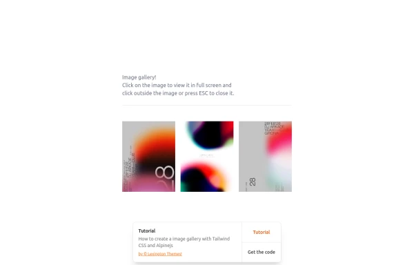 gallary
html , css
10 months ago844 -
 gallary
html , css
10 months ago664 -
 ArtoGallery
Explore a curated selection of contemporary and classic artwork, connecting collectors and creators in an inspiring online space.
9 months ago1.2k -
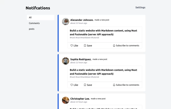 Notification
Dev Community Notification Clone
1 year ago3.2k -
 8 months ago429
 -
 Responsive navbar with alpinejs
A mix of Penguin navbar with PineUI Slide-Over
1 year ago3.4k -
 2 years ago19.6k
 -
 1 year ago5.3k
 -
 Gallery
Gallery
1 year ago3.6k -
 2 months ago151
 -
 4 months ago777
 -
 Animated Coming Soon Page 1
animated coming soon landing page
1 year ago4.1k


Explore components by Tags
Didn't find component you were looking for?
Search from 3000+ components