Ticket
Sirve para ticket
This tailwind example is contributed by ANGEL EMILIANO MARQUEZ VAZQUEZ, on 08-Nov-2024. Component is made with Tailwind v3.4. It is responsive. It supports dark mode. similar terms for this example is drawer

Related Examples
-
 Growing Navigation Menu with Tailwind CSS
PREVIEW ON FULL SCREEN BECAUSE INSIDE THE NAV BAR IT CONTAINS (aria-current="page") which create some issues inside canvas. A clean and minimal vertical navigation menu built with Tailwind CSS featuring smooth line expansion, hover interactions, and active link highlighting. The component uses lightweight CSS transitions with aria-current support for accessible active states, making it ideal for documentation websites, portfolios, dashboards, and landing pages.
272 -
 Responsive navbar with alpinejs
A mix of Penguin navbar with PineUI Slide-Over
-
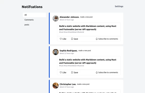 Notification
Dev Community Notification Clone
3.8k -

-
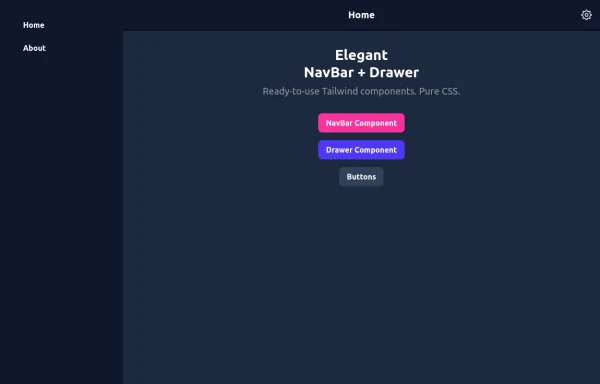 Elegant NavBar + Drawer
A NavBar, a responsive drawer/sidebar, and other useful Tailwind components to get started creating an app. Pure CSS, no JavaScript needed (although this example uses a bit of JS).
2k -

-
 1.5k
1.5k -

-
 Creative Agency Navbar with Fullscreen Mobile Menu & Animated CTA
A bold, editorial-style navigation bar designed for creative agencies, design studios, architecture firms, and portfolio websites. Built with pure HTML and Tailwind CSS, it features a minimalist branding system, fullscreen mobile navigation, animated call-to-action button, responsive layout, and modern typography inspired by premium digital agencies.
326 -
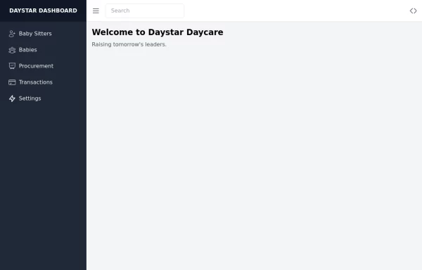 Daystar Day care Dashboard
Daystar Day care Dashboard
11.4k -
 Reader AI – Your AI-Powered Knowledge & Thinking System
Reader AI helps you read, think, and remember better. Upload books, highlight insights, chat with AI, and build a personal knowledge system that evolves with you.
546 -
 Elegant Animated Drawer
Useful Tailwind classes for constructing an animated sidebar drawer that can be controlled via labels. The component itself is pure CSS and does not require JavaScript to use (although this example uses a bit of JS).
1.6k





Browse by topic
Explore components by Tags
Jump straight to the UI pattern you need.
Can't find it?
Didn't find the component you were looking for?
Search across 3,000+ community-built components and grab the code in seconds.