Responsive Bottom Nav
Fully Responsive bottom navigation bar with both light and dark modes
This tailwind example is contributed by AKASH GANDHAR, on 19-Jul-2024. Component is made with Tailwind CSS v3. It is responsive. It supports dark mode.

Author AKASH GANDHAR
Related Examples
-
 2 years ago10.2k
 -
 8 months ago544
 -
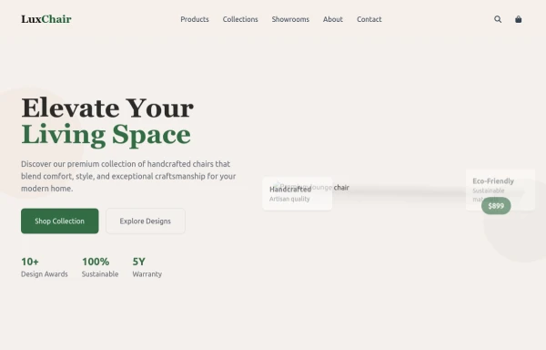 chair
chairby salvator
9 months ago1.1k -
 Responsive NavBar Using CSS Only
A complete responsive navbar only using tailwind css
8 months ago557 -
 Best Responsive Navbar Design | Easy & Modern Navigation
Learn how to create a fully responsive navbar using HTML, CSS, and JavaScript. Perfect for beginners and developers looking for a modern, mobile-friendly navigation bar.
1 year ago4.4k -
 Minimalistic navbar
Responsive navbar
3 years ago21.1k -
 2 months ago155
 -
 3 years ago16.1k
 -
 Navigation Mobile iOS
Navigation Mobile iOS
3 months ago177 -
 basichtml
this is basic html
8 months ago466 -
 Modern Website Header & Footer
I created a professional header and footer using HTML and Tailwind CSS with modern design elements, smooth animations, and interactive features.
8 months ago1.6k -
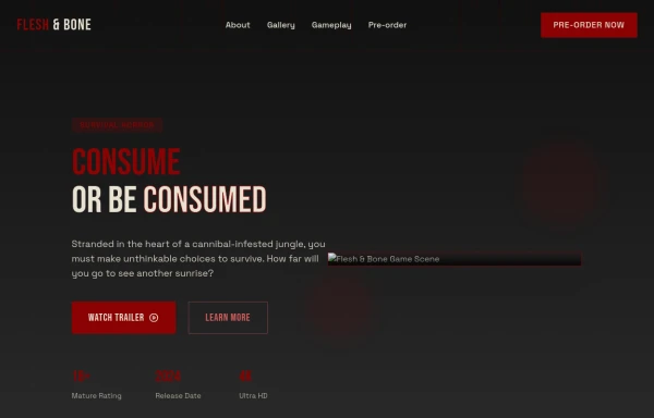 Game changer
by salvator
9 months ago977


Explore components by Tags
Didn't find component you were looking for?
Search from 3000+ components