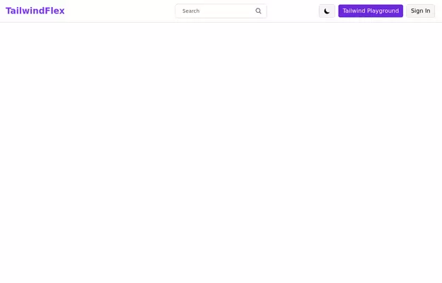
Responsive Gradient Navbar with Toggle
A modern, responsive navbar built with Tailwind CSS. Features a gradient background, flex layout, smooth hover effects, and a mobile toggle menu for optimal usability on all screen sizes.
This tailwind example is contributed by Sudip chaudhary, on 03-Jun-2025. Component is made with Tailwind CSS v3. It is responsive.

Author Sudip chaudhary
Related Examples
-
 Hero w/ navbar
the modern and clean hero section
2 years ago5.5k -
 3 years ago61.9k
 -
 pasta
pastaby salvator
9 months ago970 -
 2 years ago27.4k
 -
 modern portifolio
by salvator
9 months ago827 -
 1 year ago2.4k
 -
 1 year ago2.1k
 -
 Navigation bar
Navbar
1 year ago4.5k -
 DevPort
modern portifolio by salvator
9 months ago1.3k -
 Responsive navbar with dark mode support
Sidebar on small screen devices
3 years ago19.6k -
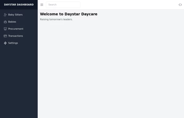 Daystar Day care Dashboard
Daystar Day care Dashboard
1 year ago10.3k -
 3 years ago14.3k


Explore components by Tags
Didn't find component you were looking for?
Search from 3000+ components