- Home
-
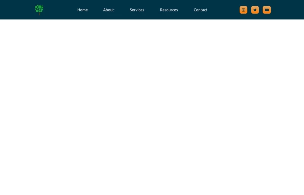
Brand Navbar
Brand Navbar
Menu side bar navigation bar
This tailwind example is contributed by ORGIN_DREAMS, on 23-May-2025. Component is made with Tailwind CSS v3. It is responsive.
Author ORGIN_DREAMS
Related Examples
-
navbar
I'll enhance this professional navbar to make it even better. Here's an improved version with additional features and refinements: html
1 month ago272 -
2 years ago16.4k
-
3 months ago454
-
Material 3 NavBar [Light]
A navbar/dock that conforms to Google's Material 3 design guidelines
1 month ago289 -
Navbar
This navbar implementation includes: 1. Responsive design that works on both desktop and mobile 2. Indigo-800 and Blue-900 color scheme for the background and accents 3. Dark mode support with a toggle button 4. Beautiful animations and effects: 1. Fade-in animation for menu items with staggered delays 2. Hover effects on menu items with underline animation 3. Smooth color transitions 4. Mobile menu slide-down animation 5. SVG icons for the dark mode toggle and mobile menu button 6. "Sign Up" call-to-action button 7. Mobile-friendly dropdown menu 8. Accessibility considerations (proper heading structure, color contrast, focus styles) Key features: - The background uses a gradient from Indigo-800 to Blue-900 - The navbar has a white background in light mode and dark gray in dark mode - Text colors are adjusted for readability in both light and dark modes - Menu items have hover effects with color changes and underline animations - The dark mode toggle changes its icon based on the current mode - The mobile menu slides down with a smooth animation when toggled - Desktop menu items fade in with a staggered delay for a smooth entrance - Dark mode is automatically applied based on system preferences - The layout is responsive, with a hamburger menu for mobile screens This implementation provides a visually appealing and functional navbar with various animations and effects, using HTML, Tailwind CSS, and vanilla JavaScript for the interactions.
7 months ago3.4k -
Tailwind Sidebar Layout (improved)
Improved Tailwind Sidebar Layout. - Responsive sidebar working - Close responsive sidebar working - Positioning menu-toggle correctly - Added some fresh icons - Added sub-items - showing on click - Added animation and swap on icons using 'peer'
7 months ago2.5k -
Frontend Template Open Source Code Website
This frontend template is designed for a website that provides software services and open-source code to users. It serves as a clean, modern UI for browsing, searching, and downloading open-source projects. Building with HTML, tailwindcss for CSS ,
1 week ago129 -
portifolio
skills
1 month ago134 -
Responsive navbar with dark mode support
Sidebar on small screen devices
11 months ago1.9k -
chair
by salvator
1 month ago187 -
3 months ago2.5k
-
3 months ago1.3k
Explore components by Tags
Didn't find component you were looking for?
Search from 2400+ components