Post Responsive Grid
Laravel News post grid
This tailwind example is contributed by Mr Robot, on 29-Aug-2022. Component is made with Tailwind CSS v3.

Author Mr Robot
Related Examples
-
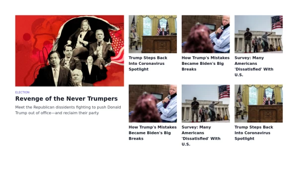 News website like card grid
fancy card grid
3 years ago14.1k -
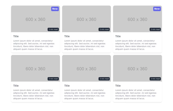
 Responsive card grid
Responsive card grid for posts section
3 years ago11.3k -
 Tailwind image gallery
Responsive grid with evenly spaced image cards. Each card has a title label at the bottom, and there's a subtle hover effect for interactive engagement.
3 years ago60.9k -
 2 years ago20.3k
 -
 3 years ago11.1k
 -
 Verticle card grid
Best suited for news websites
3 years ago13.7k -
 Image Grid
The layout is designed to showcase various categories or items using images and descriptive text. Each grid item features a high-quality image and a centered text overlay with a semi-transparent background
2 years ago14.4k -
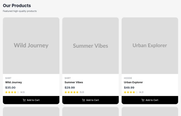
 Responsive Card Grid
Tailwind CSS responsive grid for feature listing. The cards have a teal background, rounded corners, and a concise display of feature titles, descriptions, and a "Learn More" link.
3 years ago52.1k -
 3 years ago24.1k
 -
 Animated Feature Grid Component with Tailwind CSS
Animated feature grid component built with Tailwind CSS. Features smooth hover animations, gradient cards, dark mode support, and responsive design. Perfect for showcasing product features.
1 month ago328 -
 3 months ago117
 -
 1 year ago1.3k


Explore components by Tags
Didn't find component you were looking for?
Search from 3000+ components