bottom drawer with Tailwind CSS and Alpinejs
This tailwind example is contributed by Michael Andreuzza, on 27-Apr-2024. Component is made with Tailwind CSS v3. It is responsive. similar terms for this example are CTA,banner

Author Michael Andreuzza
Related Examples
-
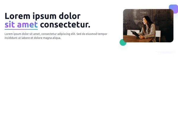 Free Responsive Hero Section
Get this professional hero section for your website. Includes a gradient text effect, stylish background blurs, and a perfectly aligned image section. Easy to integrate and fully customizable for any project.
2 months ago87 -
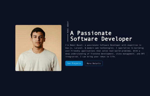 Responsive About Section with Tailwind CSS
Built a sleek and fully responsive About Section for my portfolio using Tailwind CSS! 🚀 Designed for smooth adaptability across all screen sizes with a modern and minimal aesthetic. Perfect for showcasing skills, experience, and a personal touch!
8 months ago1.3k -
 Modern CTA section
CTA with background patterns
1 year ago2.4k -
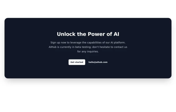 Call-to-Action Card
Early Access Signup Card
1 year ago1.9k -
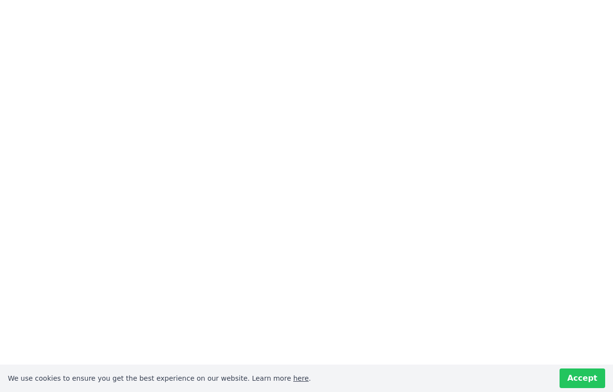
 Cookie Consent bottom banner
Ask for cookie consent
1 year ago2.5k -
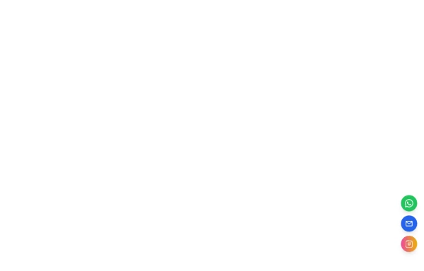 Floating Action Button
This component displays a fixed, floating contact button panel positioned at the bottom-right corner of the screen. It provides users with quick access to key communication channels including WhatsApp, Email, and Instagram. Each icon is styled with vibrant, platform-specific colors and includes subtle hover animations for an interactive user experience. Ideal for improving accessibility and encouraging user engagement, especially on mobile devices.
7 months ago1.1k -
 CTA block
with user avatars and 2 buttons
1 year ago2.3k -
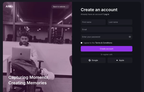 Login page
Login and register page, you can reuse both
10 months ago1.7k -
 2 years ago16.8k
 -
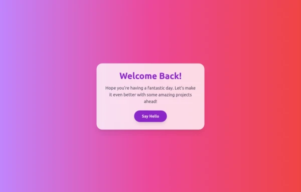 Boimator welcoming back
Boimator welcoming back
3 months ago256 -
 8 months ago820
 -
 Solo leveling
Animation & movie field,videos,games.
6 months ago767


Explore components by Tags
Didn't find component you were looking for?
Search from 3000+ components