Internet Connection Check
A sleek and responsive Internet connection status checker built with Tailwind CSS and Alpine.js. This component provides real-time feedback about the user's internet connection status.
This tailwind example is contributed by Maxim, on 14-Jan-2025. Component is made with Tailwind CSS v3. It is responsive.

Author Maxim
Related Examples
-
 2 years ago3.6k
 -
 2 years ago10.5k
 -
 9 months ago1.2k
 -
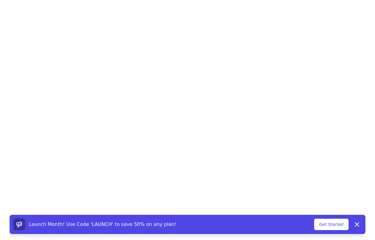 Promotional notification
sticky bottom promotional banner
3 years ago10.3k -
 1 year ago5.9k
 -
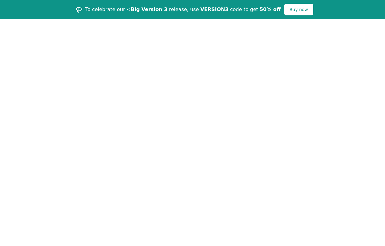
 Tailwind css banner offer
Bold neobrutalist design with thick borders, vibrant colors, and strong shadows - perfect for promotions.
6 months ago565 -
 cards
cardscards slices
2 years ago6.9k -
 1 year ago1.1k
 -
 3 years ago12.7k
 -
 Stats Banner Example
Show your stats proudly
1 year ago2.2k -
 Grid
GridGrid Grid-Cards
1 year ago2.1k -
 SocialSphere: A Full-Stack Social Media Platform
SocialSphere is a full-stack social media platform inspired by Facebook, built using HTML CSS
9 months ago863


Explore components by Tags
Didn't find component you were looking for?
Search from 3000+ components