Black friday sale / deal banner
This tailwind example is contributed by Conan Hilton, on 13-Jun-2023. Component is made with Tailwind CSS v3.

Author Conan Hilton
Related Examples
-
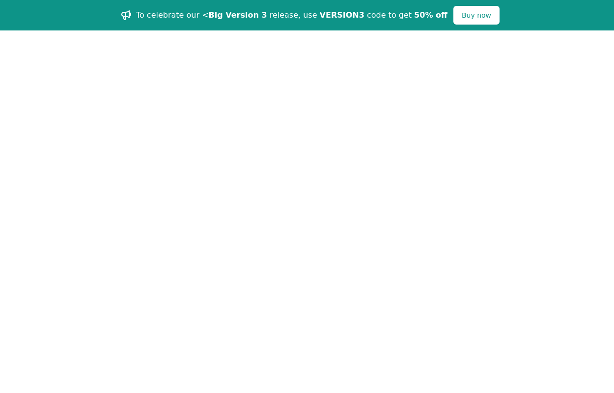
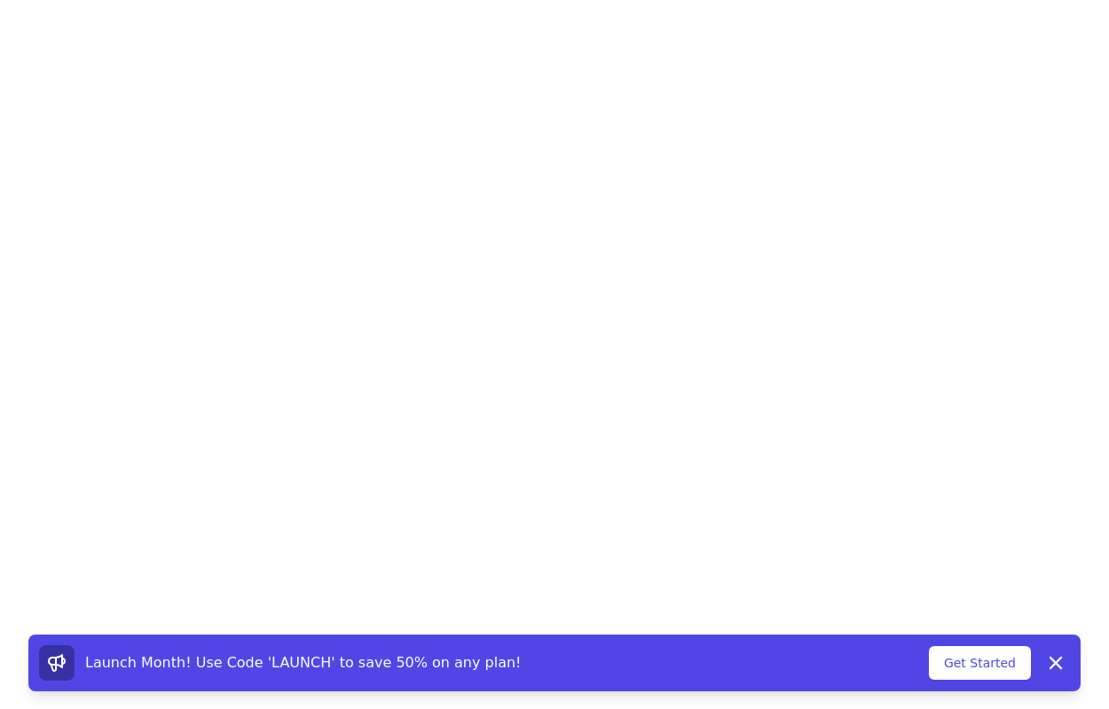 Promotional notification
sticky bottom promotional banner
3 years ago10.3k -
 3 years ago12.8k
 -
 2 years ago3.7k
 -
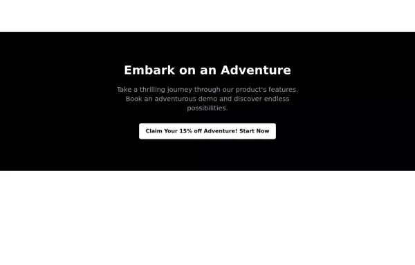 CTA banner
Capture the attention of the user with full-width CTA Section
2 years ago4.7k -
 1 year ago1.9k
 -
 1 year ago1.3k
 -
 Your Creative Login Page
"Animated Image Login UI" "Tailwind Image Login with Animated Background" "Innovative User Login Experience" "Creative Bubble Background Login" "Login with Personality — Featuring Your Image" "Acode Master Animated Login" ✅ (customized for you)
10 months ago900 -
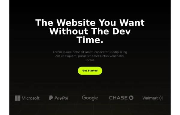 Premium SAAS HERO Section
A hero section for your SAAS application
1 year ago3.1k -
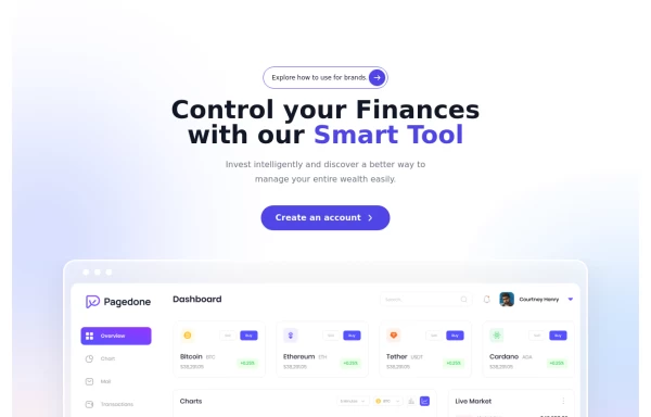 Modern SAAS Hero Section
A 2-column responsive hero section for modern SAAS APP
1 year ago5.1k -
 Internet Connection Check
A sleek and responsive Internet connection status checker built with Tailwind CSS and Alpine.js. This component provides real-time feedback about the user's internet connection status.
1 year ago1.6k -
 Hero Section
A 2 column responsive hero section
1 year ago2.9k -
 Stats Banner Example
Show your stats proudly
1 year ago2.3k


Explore components by Tags
Didn't find component you were looking for?
Search from 3000+ components