images
This tailwind example is contributed by Maxim, on 31-Jan-2024. Component is made with Tailwind CSS v3. It is responsive.

Author Maxim
Related Examples
-
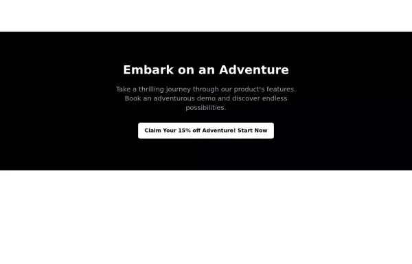
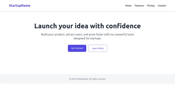
 Welcome banner for developers portfolio
A hero section welcoming visitors to a portfolio or website. It features a large, visually appealing title and an image.
2 years ago10.9k -
 2 years ago10.5k
 -
 cards
cardscards slices
2 years ago7k -
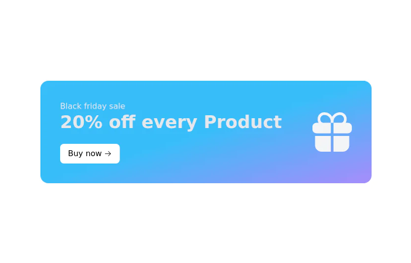
 CTA banner
Capture the attention of the user with full-width CTA Section
2 years ago4.7k -
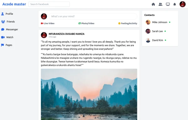 SocialSphere: A Full-Stack Social Media Platform
SocialSphere is a full-stack social media platform inspired by Facebook, built using HTML CSS
9 months ago973 -
 9 months ago1.4k
 -
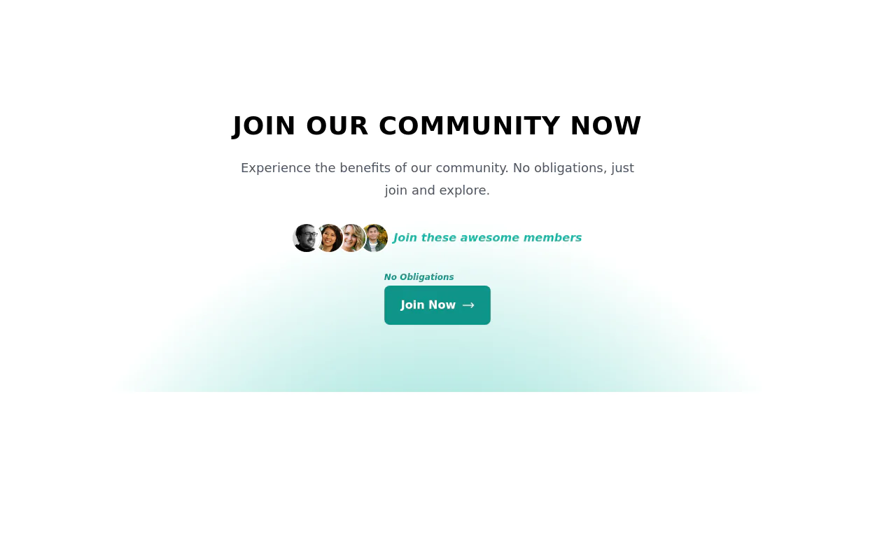 Join Our Community Banner
Encourage users to become members of a community.
2 years ago8.6k -
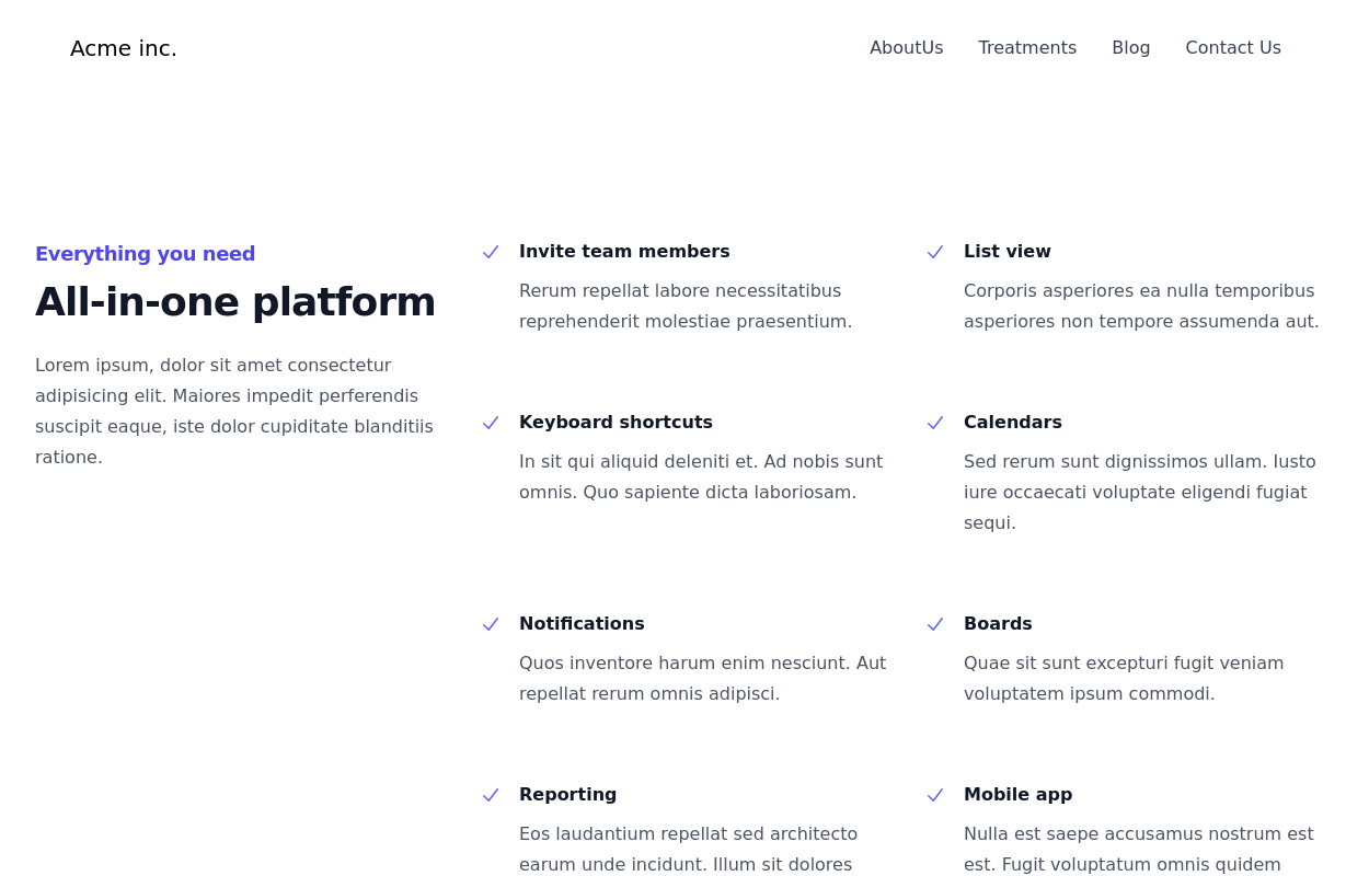
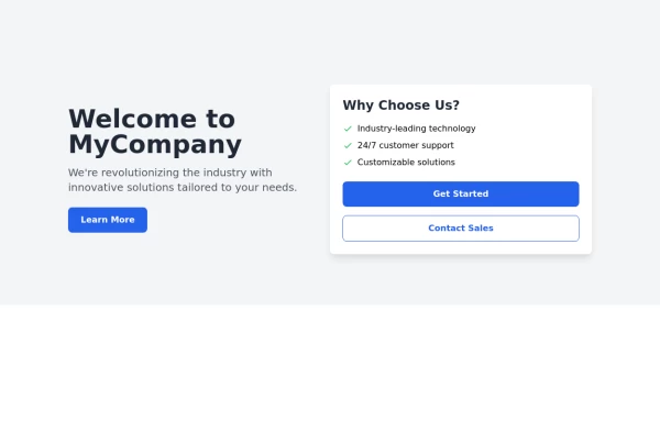 Responsive Hero Section
Key features of this hero section: 1. Responsive layout: Uses a column layout on mobile and switches to a row layout on medium screens and larger. 2. Left side: - Company name as a large heading - Brief description - "Learn More" button 3. Right side: - "Why Choose Us?" section with bullet points - Two call-to-action buttons: "Get Started" and "Contact Sales" 4. Styling: - Uses Tailwind's utility classes for responsive design, colors, spacing, and typography - Incorporates a shadow and rounded corners for the right-side content box - Includes hover effects on buttons for better interactivity This hero section will be fully responsive: - On mobile devices, it will stack vertically with the company info on top and the details below. - On larger screens, it will display in a two-column layout. The use of Tailwind CSS classes ensures that the design is consistent and easily adjustable. You can further customize the colors, fonts, and spacing to match your brand's specific design guidelines. Would you like me to explain any part of this code or make any adjustments?
1 year ago2.8k -
 Stats Banner Example
Show your stats proudly
1 year ago2.2k -
 1 year ago5.9k
 -
 3 years ago12.8k
 -
 1 year ago1.2k


Explore components by Tags
Didn't find component you were looking for?
Search from 3000+ components