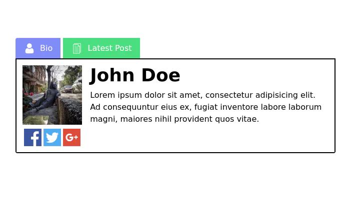
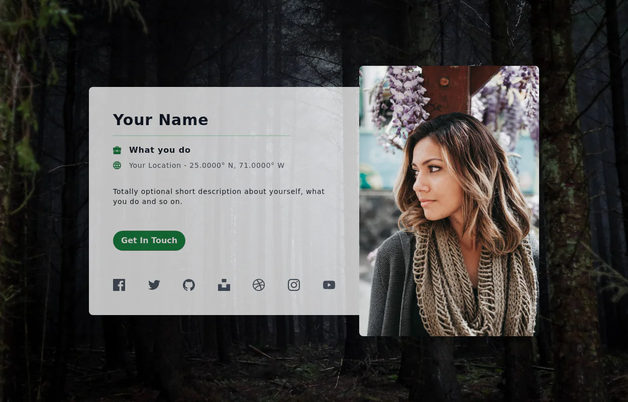
Portfolio
This tailwind example is contributed by Aitrik Saha, on 20-Jan-2025. Component is made with Tailwind CSS v3. It is responsive. similar terms for this example are Author box, User information

Author Aitrik Saha
Related Examples
-
 Modern Responsive Footer with Tailwind CSS
This sleek and modern responsive footer is built using HTML and Tailwind CSS. It features three sections: brand information, useful links, and social media icons. The footer includes smooth hover effects, subtle fade-in animations, and a fully responsive design that adapts seamlessly to different screen sizes. Perfect for websites looking for a professional and stylish footer section.
1 year ago2.1k -
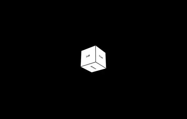 3d Box
Let's build a 3d world empowered by Orgin Dreams.these are 3d objects
9 months ago736 -
 9 months ago1.4k
 -
 Acode Master
Acode Master is a skilled and passionate software developer known for mastering coding and creating innovative tech solutions. Specializing in modern web technologies like React.js, Node.js, PHP, and databases such as MySQL and PostgreSQL, Acode Master builds practical, efficient, and scalable applications. Beyond coding, Acode Master is dedicated to continuous learning, sharing knowledge, and empowering others through technology-driven projects and education.
9 months ago1.4k -
 3 years ago25.6k
 -
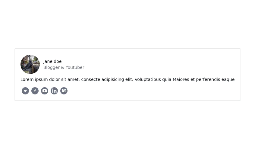
 Profile Form
Enhanced User Profile Form with Stunning Profile and Cover Image Fields
9 months ago1.2k -
 3 years ago11.5k
 -
 4 months ago502
 -
 Internet Connection Check
A sleek and responsive Internet connection status checker built with Tailwind CSS and Alpine.js. This component provides real-time feedback about the user's internet connection status.
1 year ago1.5k -
 3 years ago11.8k
 -
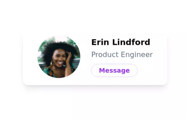
 User Profile Card
Full-page Profile card
3 years ago19.5k -
 3 years ago12.2k


Explore components by Tags
Didn't find component you were looking for?
Search from 3000+ components