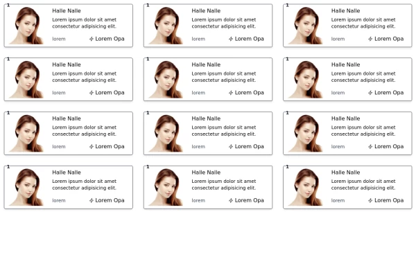
Mobile/Desktop
This tailwind example is contributed by Maxim, on 09-Feb-2024. Component is made with Tailwind CSS v3. It is responsive.

Author Maxim
Related Examples
-
 masonary grids effect for cards using columns
As part of the redesign I was trying to think of ways to lay out testimonials from students, which may have varying length/content, I stumbled onto the idea of using a masonry layout (think bricks, think Pinterest).
11 months ago1.3k -
 Blog Post Showcase
a grid showcasing the blog posts with images and brief descriptions
1 year ago4.5k -
 3 years ago10.3k
 -
 Products card grid
Example of product card grid with product image and pricing
3 years ago24k -
 Grid
GridGrid Grid-Cards
1 year ago2.1k -
 Card
Cardtravel place card hover effect card
11 months ago2k -
 2 years ago20.4k
 -
 3 years ago13.2k
 -
 Images grid
Responsive image grid with tailwindcss.
2 years ago19.2k -
 Feature overview cards
The component is designed to be responsive, featuring a title, a brief description, and a set of cards presenting key metrics.
2 years ago5.4k -
 Card KPI
Targetas ahora con un grafico
3 months ago586 -
 Table CRUD
CRUD TABLE DESIGN
11 months ago3.6k


Explore components by Tags
Didn't find component you were looking for?
Search from 3000+ components