Experiance & Explanation
Here my beautiful component that is being seen and used more and more. Hopefully you like it and find it useful too
This tailwind example is contributed by Matti, on 16-Jan-2025. Component is made with Tailwind v3.4. It is responsive. It supports dark mode. similar terms for this example are Services,Why choose us

Related Examples
-
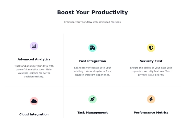 Feature Showcase Section with Font Awesome Icons
showcase the features of a product or service. The features are presented in a grid.
7.4k -

-
-
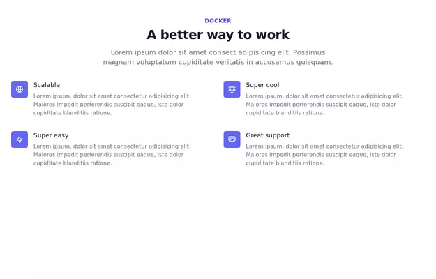 Feature Showcase
Showcase Features of your product
11.9k -
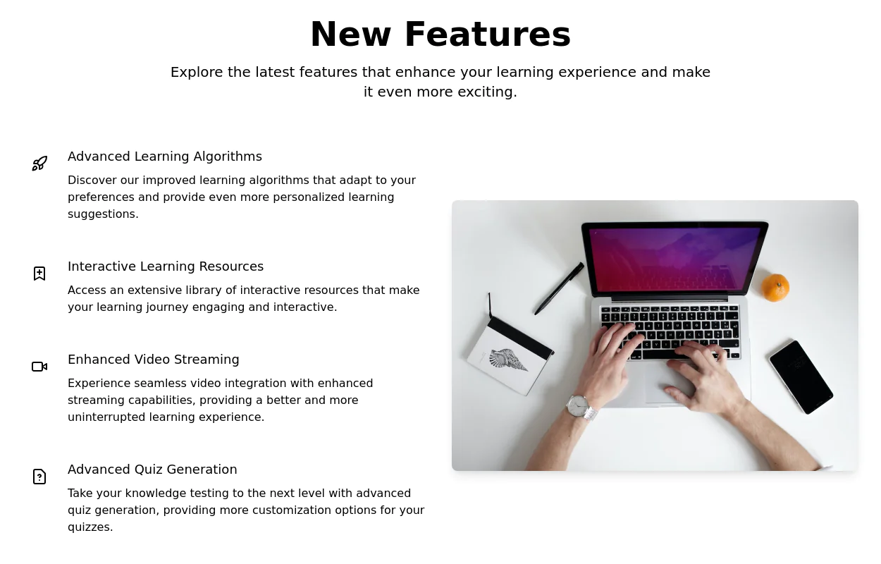 Product Feature Section
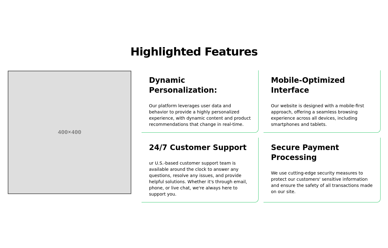
present multiple product features in a grid layout. Each feature is represented by an icon, title, and description.
10k -

-
-
-
 CTA Responsive
Gradient Style CTA
1k -
 Responsive Card Grid
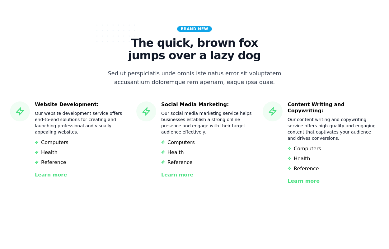
Tailwind CSS responsive grid for feature listing. The cards have a teal background, rounded corners, and a concise display of feature titles, descriptions, and a "Learn More" link.
53.9k -
 Responsive Features Cards Section
A modern and fully responsive services section featuring premium glassmorphism cards, interactive hover effects, smooth animations, and a clean multi-column grid layout. Perfect for SaaS, startups, agencies, portfolios, business websites, and landing pages. Built with semantic HTML and easy-to-customize CSS for seamless integration into any modern web project.
251 -
 Facts
Large fact counters with the "centered" title, a quarter overstand to the right site. Die JS-Line set the titles, so you only have to change the text -- and or modify the counters- or the titles background-color. [VIEW-NOTICE] If you change the from XS over MD to XL ... right-click here into the showcase and click "reload frame" or test it on you own site directly.
2.2k






Browse by topic
Explore components by Tags
Jump straight to the UI pattern you need.
Can't find it?
Didn't find the component you were looking for?
Search across 3,000+ community-built components and grab the code in seconds.