Feature cards for company website
Each card provides a brief description of a specific feature, making it easy for users to understand the benefits and capabilities of our services
This tailwind example is contributed by Anonymous, on 09-Nov-2023. Component is made with Tailwind CSS v3. It is responsive. similar terms for this example are Services,Why choose us

Author Anonymous
Related Examples
-
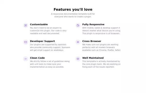
 Features section
Showcase your key features
3 years ago17k -
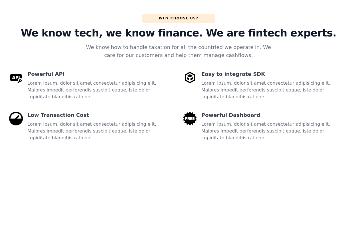
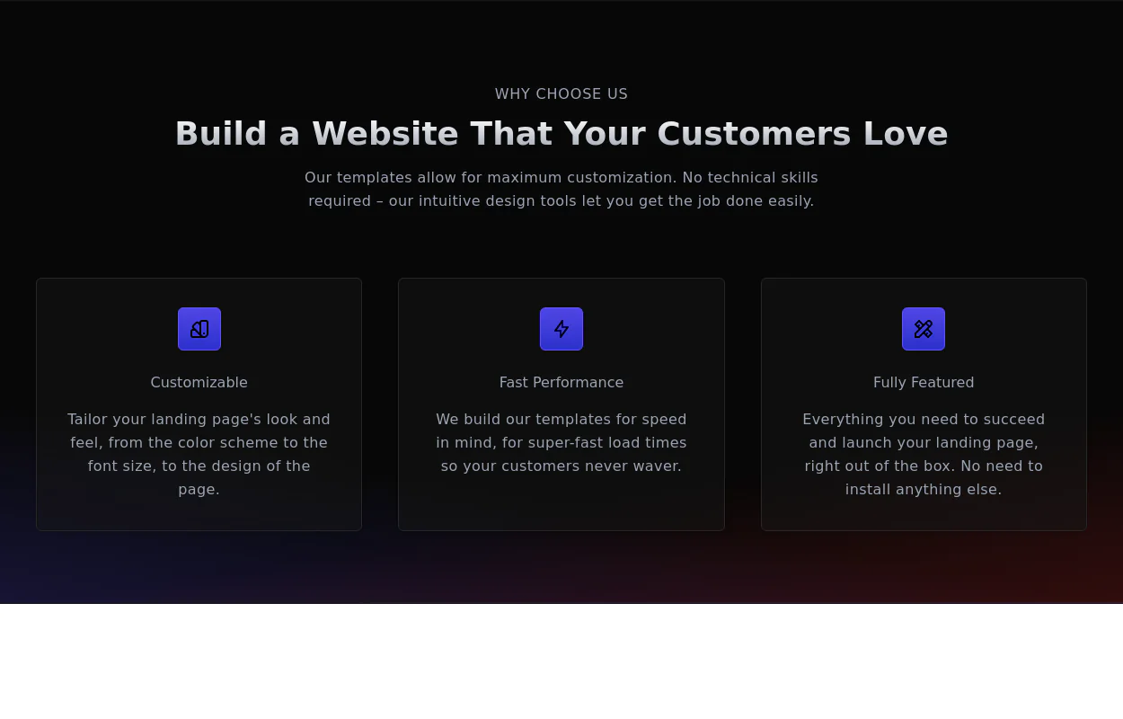 Why choose us section
list your product features beautifully
2 years ago28.8k -
 Features grid example
Tailwind clean and responsive features section with the heading
2 years ago14.2k -
 2 years ago14.5k
 -
 2 years ago14.9k
 -
 3 years ago11.1k
 -
 2 years ago17.2k
 -
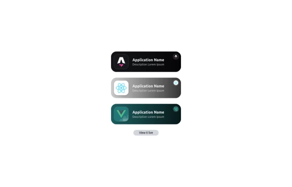 Applications Showcase
This is a stylish and interactive application showcase component designed for web use. It features the following elements: Background Styling: The main container has a rounded-rectangle shape (rounded-3xl) with a subtle white base overlaying a high-resolution background image, styled with background-size: 600px for an artistic touch. The image itself dynamically serves as a backdrop, giving the component a layered appearance. Main Icon: A small circular icon, located at the top-right corner, appears with smooth hover effects: Enlarges to double its size (scale-[2]). Rotates (rotate-[410deg]). Moves diagonally upwards-right (translate-x-3, -translate-y-3). These transitions occur over a duration of 1 second (transition duration-1000). Overlay Gradient: A transparent gradient overlay (bg-gradient-to-l) adds a polished depth effect, transitioning from black (from-black/80) to lighter shades. App Icon and Info: Icon: The app icon is a smaller, bordered square image (rounded-2xl) with hover shrink animations (group-hover:scale-95). Text: A bold application title (text-md font-semibold) with hover-animated underline effects that gradually expand from left to right. A short app description styled as secondary text. Call-to-Action Button: Below the card is a subtle, rounded button (rounded-full) encouraging interaction. It features: A hover effect with color inversion (gray to black). A lift effect (hover:-translate-y-1) when hovered. This component is perfect for modern app showcases, offering a dynamic, user-friendly visual experience. It ensures a professional look while engaging users through smooth animations and clear calls to action.
1 year ago2.8k -
 11 months ago1.1k
 -
 Premium High-Performance Web Gaming Hub
Experience the future of browser-based gaming. I’ve developed a premium arcade hub designed for speed, clarity, and zero-latency gameplay. Built with modern web technologies, Ayyamperumal Games brings AAA-inspired visuals and high-octane mechanics directly to your browser—no downloads, no lag, just pure performance. Explore a curated library of titles ranging from minimalist logic puzzles like Sudoku Elite to fast-paced action in Neon Drift. This is where clean code meets high-level entertainment.
2 months ago407 -
 3 years ago11.3k
 -
 4 months ago618


Explore components by Tags
Didn't find component you were looking for?
Search from 3000+ components