Feature Cards Section
showcase key features or benefits with cards.
This tailwind example is contributed by Anonymous, on 17-Jan-2024. Component is made with Tailwind CSS v3. It is responsive. similar terms for this example are Services,Why choose us

Author Anonymous
Related Examples
-
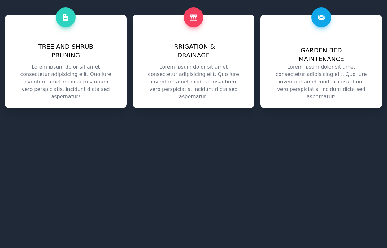
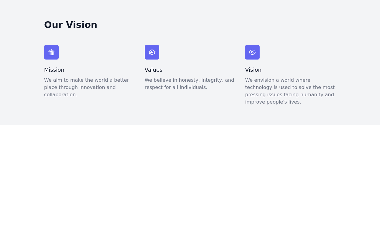
 Features showcase section
showcase key features and benefits
2 years ago7.3k -
 2 years ago17k
 -
 free tailwind personal portfolio template
free tailwind personal portfolio template
1 year ago5.3k -
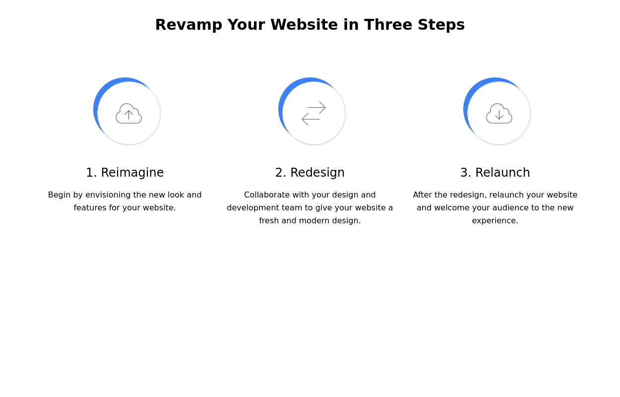 Steps section
Show features or steps of your website. Each step Includes Icons.
2 years ago9.5k -
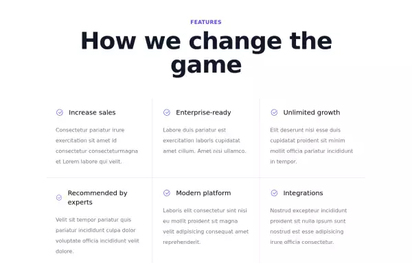
 Services showcase Section
With hover effect on cards
1 year ago2.5k -
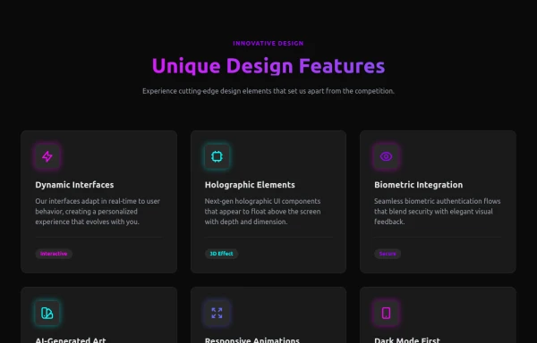 Attractive Feature Section
With Gradient Color 6 Features
6 months ago814 -
 2 years ago14.3k
 -
 Premium High-Performance Web Gaming Hub
Experience the future of browser-based gaming. I’ve developed a premium arcade hub designed for speed, clarity, and zero-latency gameplay. Built with modern web technologies, Ayyamperumal Games brings AAA-inspired visuals and high-octane mechanics directly to your browser—no downloads, no lag, just pure performance. Explore a curated library of titles ranging from minimalist logic puzzles like Sudoku Elite to fast-paced action in Neon Drift. This is where clean code meets high-level entertainment.
3 weeks ago175 -
 2 years ago12.2k
 -
 1 year ago1.4k
 -
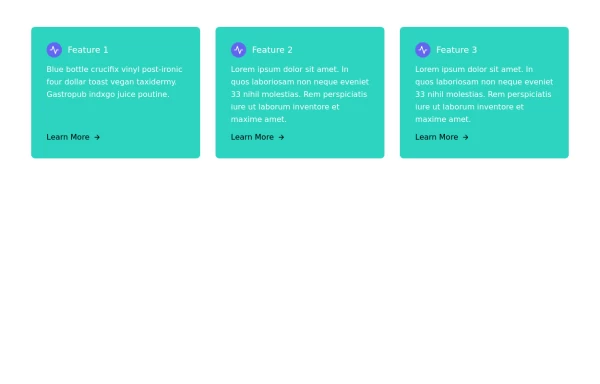 Responsive Card Grid
Tailwind CSS responsive grid for feature listing. The cards have a teal background, rounded corners, and a concise display of feature titles, descriptions, and a "Learn More" link.
1 year ago2.1k -
 Work Showcase Cards
Highlight your top projects or products with these cards, featuring images and brief descriptions. This example has a subtle hover effect.
2 years ago12.5k


Explore components by Tags
Didn't find component you were looking for?
Search from 3000+ components