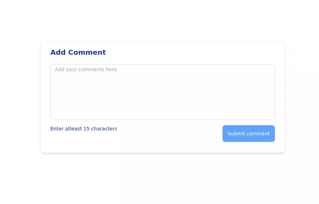
Designing a Responsive Form Layouts with Tailwind CSS
Enhance your web application by building a sleek and responsive Form Layouts using Tailwind CSS. This comprehensive guide walks you through creating an interactive Form Layouts section featuring.
This tailwind example is contributed by zobaidul kaziex, on 27-Aug-2024. Component is made with Tailwind CSS v3. It is responsive. It supports dark mode. similar terms for this example are Author box, User information

Author zobaidul kaziex
Related Examples
-
 bardui.com feedback modal
feedback form will be engaging and user-friendly. Ideal for collecting valuable user opinions and improving your website’s interaction. Explore practical examples and templates for seamless integration.
1 year ago2k -
 portfolio
Complete Portfolio UI Kit with hero, about, skills, projects, testimonials, contact form, and footer. Fully responsive and dark mode supported using Tailwind CSS.
8 months ago836 -
 3 years ago11.8k
 -
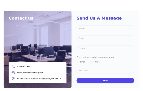 tailwind contact form
tailwind contact form
1 year ago3.5k -
 3 years ago13.8k
 -
 Onhover Dropdown
Open dropdown on hover
3 years ago18.5k -
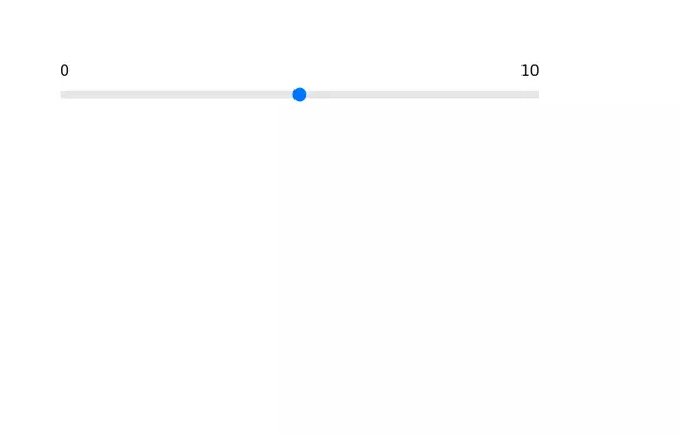 Range slider
Range slider with upper limit and lower limit.
3 years ago12.3k -
 3d Box
Let's build a 3d world empowered by Orgin Dreams.these are 3d objects
9 months ago692 -
 Cards
Cardsthe best tailwind cards with responsive
9 months ago965 -
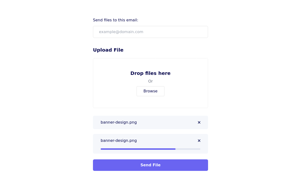
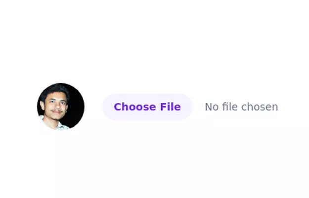 Image input with preview
Show you a preview of the selected image.
3 years ago27.6k -
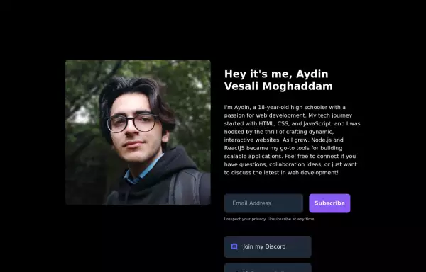 My Personal Landing page
This HTML document showcases Aydin Vesali Moghaddam's personal portfolio, highlighting his journey in web development. The page features a responsive design that adapts to various screen sizes, ensuring a seamless user experience across devices. It includes a personal introduction, a brief overview of Aydin's tech journey, and a contact form for visitors to subscribe to updates. Additionally, the page provides links to Aydin's Discord, website, and Twitter, offering multiple avenues for connecting and staying updated on his projects.
1 year ago6.2k -
 7 months ago663


Explore components by Tags
Didn't find component you were looking for?
Search from 3000+ components