Checkbox button
press the button to check
This tailwind example is contributed by Anonymous, on 17-Feb-2024. Component is made with Tailwind CSS v3. It is responsive. It supports dark mode.

Author Anonymous
Related Examples
-
 2 years ago12.8k
 -
 Radio Buttons
Users can click anywhere on the input field to select the radio option
3 years ago17k -
![Material 3 Text Fields [Light]](https://tailwindflex.com/storage/thumbnails/material-3-text-fields-light/canvas.min.webp?v=3) Material 3 Text Fields [Light]
Material 3 Text Fields [Light]Text fields that conform to Google's Material 3 design guidelines. Can be used for single-line text fields as well as textareas.
8 months ago805 -
 3 years ago14.4k
 -
 tailwind contact form
tailwind contact form
1 year ago3.5k -
 3 years ago12.3k
 -
 3 years ago11.9k
 -
 2 years ago4.2k
 -
Hover Button
Hover button then a overlay came from bottom to top
1 year ago2.2k -
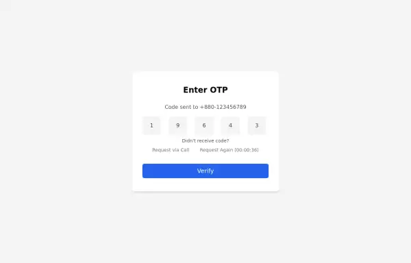 Simple OTP box Form
A Simple OTP form with full responsiveness && dark mode supported
1 year ago3.5k -
 11 months ago1.4k
 -
 2 years ago10.5k


Explore components by Tags
Didn't find component you were looking for?
Search from 3000+ components