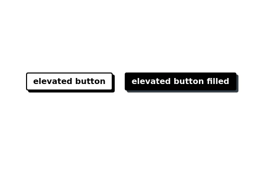
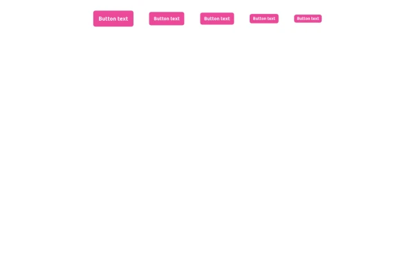
Button with shadow
This tailwind example is contributed by Laurits, on 22-Nov-2022. Component is made with Tailwind CSS v3. It is responsive. It supports dark mode.

Author Laurits
Related Examples
-
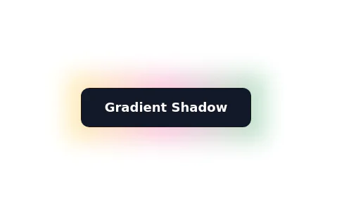
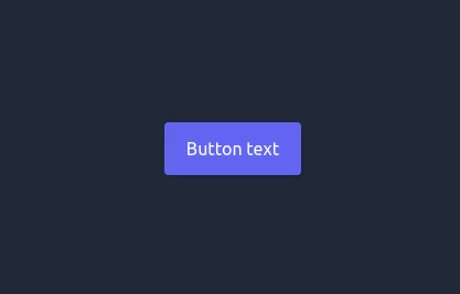
Glowing gradient button
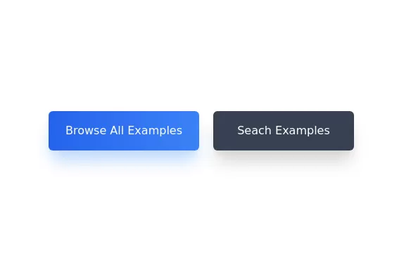
Button on black background
3 years ago39.2k -
 3 years ago14.5k
 -
 3 years ago17.6k
 -
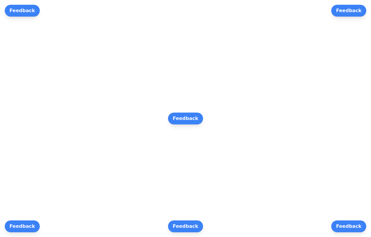 Floating buttons examples
Bottom-Right Corner, Bottom-Left Corner, Top-Left Corner, Top-Right Corner, Center, Bottom-Center
2 years ago25.6k -
3 years ago16.2k
-
 1 year ago2.5k
 -
 shadcn Button
button
1 year ago2.5k -
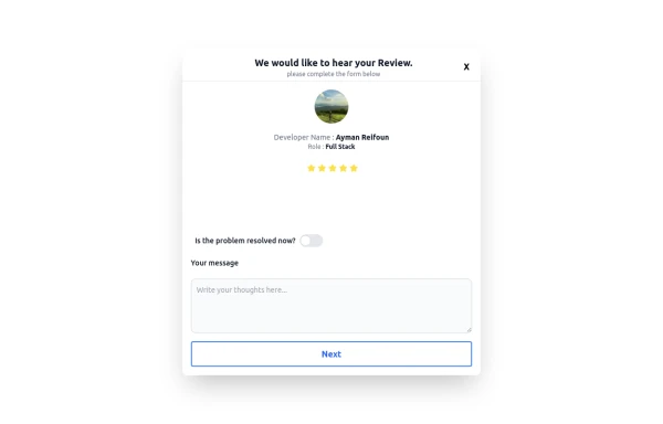 Review popup form with toggle and stars
Review popup form with toggle and stars
9 months ago806 -
 Buttons - Htmlwind
Primary buttons
8 months ago600 -
 3 years ago12.3k
 -
1 year ago2.4k
-
 Ripple Button
Ripple Button is an interactive button component with a ripple animation that responds to user clicks
1 year ago1.2k


Explore components by Tags
Didn't find component you were looking for?
Search from 3000+ components