Neomorphism button
This tailwind example is contributed by Akram Khan, on 27-Jul-2024. Component is made with Tailwind CSS v3. It is responsive.

Author Akram Khan
Related Examples
-
 Sharp corner button design
button with hover effect
3 years ago12.8k -
 Tilted button on hover.
A simple button with a gradient and tilt on hover. Dark mode supported with same color.
1 year ago1.3k -
 3 years ago10.3k
 -
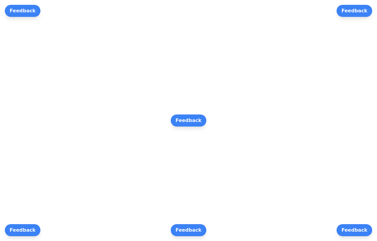 Floating buttons examples
Bottom-Right Corner, Bottom-Left Corner, Top-Left Corner, Top-Right Corner, Center, Bottom-Center
2 years ago25.9k -
 3 years ago16.5k
 -
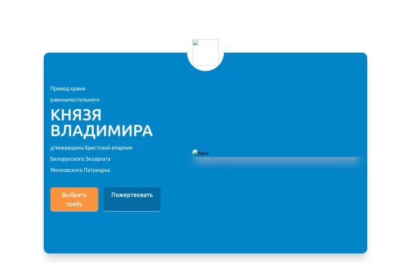 Home page 2
Отзывчивый логотип по центру. Интерактивные кнопки призыва к действию.
1 year ago918 -
Button wih hover gradient
Works well with the dark theme
2 years ago18.3k -
Hover Button
Hover button then a overlay came from bottom to top
1 year ago2.2k -
 DevPort
modern portifolio by salvator
10 months ago1.3k -
 Input Formulario
Input used in the form Link form: https://tailwindflex.com/@ameth1208/login
1 year ago3k -
 Button group
nice and simple buttons with a hover effect
3 years ago8.4k -
 3 years ago19.6k


Explore components by Tags
Didn't find component you were looking for?
Search from 3000+ components