Boarding Pass Design
Testing out a layout and design for a digital boarding pass
This tailwind example is contributed by Kirsten F, on 12-Jun-2025. Component is made with Tailwind CSS v3. It is responsive.

Author Kirsten F
Related Examples
-
 3 years ago12.6k
 -
 Login AND Signup
login and signup
9 months ago810 -
 Checkbox
Checkbox
1 year ago2.4k -
1 year ago3.3k
-
 Atlas AI Analyst Workspace
A premium, document-centric AI chat interface that moves beyond standard bubbles into a professional "editor" layout. Designed for power users, it features a floating glassmorphic command bar, a dedicated "Memory & Context" sidebar with interactive widgets, and rich data visualization blocks. The aesthetic combines a deep charcoal base with luxury bronze/orange accents, making it ideal for high-end SaaS tools, financial analysis dashboards, or enterprise AI assistants.
2 months ago131 -
 9 months ago1.2k
 -
 templete
templete
9 months ago775 -
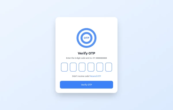 OTP Verification Page
A responsive and interactive OTP verification page built with Tailwind CSS. The page features a gradient background, hover effects, and animations to enhance user experience. It includes input fields for the OTP, a resend OTP link, and a verify button. The design is optimized for both light and dark modes.
1 year ago2.7k -
 Horizon Premium Dashboard Tailwind
Website Dashboard Admin with tailwind CSS CDN
1 month ago257 -
 Pricing Plans
This plan offers access to all basic features, including unlimited projects and 24/7 support
9 months ago768 -
 Basic Terms of Service Page
Basic Terms of Service Page setup for light and dark mode. Repeat the sections to add as many as you need.
1 year ago3.7k -
 2 years ago18.7k


Explore components by Tags
Didn't find component you were looking for?
Search from 3000+ components