Basic Terms of Service Page
Basic Terms of Service Page setup for light and dark mode. Repeat the sections to add as many as you need.
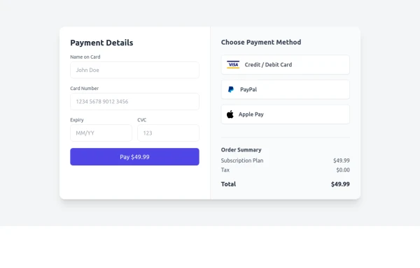
This tailwind example is contributed by Monica D., on 15-Jul-2024. Component is made with Tailwind CSS v3. It is responsive. It supports dark mode.

Author Monica D.
Related Examples
-
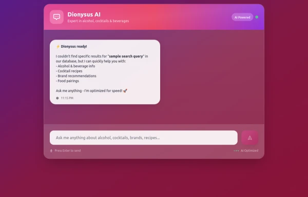
 2 years ago13.5k
 -
 8 months ago1.1k
 -
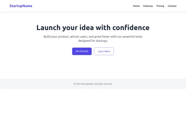
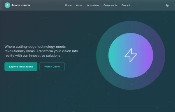
 Simple Hero Section
Hero Section using Tailwind
11 months ago1.2k -
 free tailwind resume template
free tailwind resume template
1 year ago3.7k -
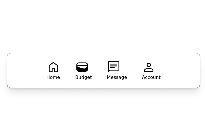
 Elegant Dock
Useful Tailwind classes for constructing a basic Dock (usually used on mobile).
8 months ago829 -
 7 months ago1.4k
 -
 3 months ago550
 -
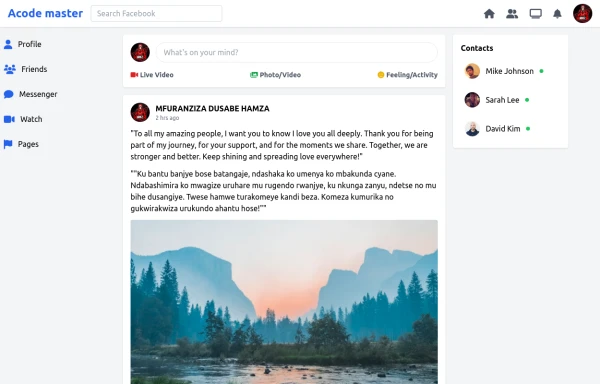 SocialSphere: A Full-Stack Social Media Platform
SocialSphere is a full-stack social media platform inspired by Facebook, built using HTML CSS
7 months ago837 -
 2 years ago9.9k
 -
 Full HTML Version
What's Included: Title*: Required input Description: Optional textarea Fully responsive and dark mode ready Simple validation (required on title)
8 months ago575 -
 Aurora Spinner
Aurora Spinner using tailwindcss
1 year ago1.3k -
 7 months ago552


Explore components by Tags
Didn't find component you were looking for?
Search from 3000+ components