Checkbox
Checkbox
This tailwind example is contributed by Aman kumar, on 28-Jun-2024. Component is made with Tailwind CSS v3. It is responsive.

Author Aman kumar
Related Examples
-
 3 years ago9.7k
 -
 Floating "Go to Top" Button with Tailwind CSS
🚀 Boost your website’s user experience with a sleek floating "Go to Top" button! This easy-to-implement solution uses Tailwind CSS for styling. ✔️ Smooth scroll to top ✔️ Clean and modern design ✔️ Responsive and animated effects Perfect for any website or portfolio! Add it today and make navigation effortless! 🔝💻
11 months ago1k -
 Simple Login & Register Page
Login and Register Page using Tailwind, Alpine JS, and Fontawesome
1 year ago3.2k -
 3 years ago13.6k
 -
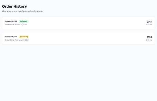 Order History
Order History
11 months ago1.1k -
 Health Tracker - Diet Calorie Management App
Health Tracker - Diet Calorie Management App
2 months ago157 -
 ForK blocks animations
ForK blocks animations
1 year ago1.8k -
 2 years ago14k
 -
 3 months ago426
 -
 1 month ago43
 -
 Frontend Template Open Source Code Website
This frontend template is designed for a website that provides software services and open-source code to users. It serves as a clean, modern UI for browsing, searching, and downloading open-source projects. Building with HTML, tailwindcss for CSS ,
9 months ago1.2k -
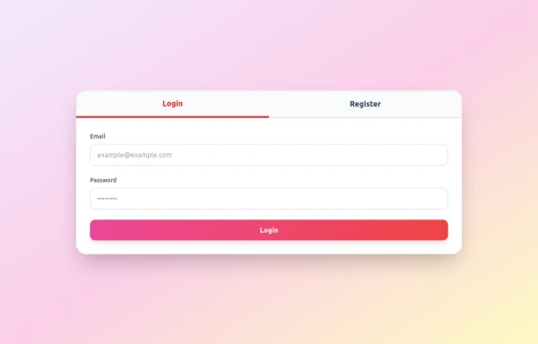 Login / Register Form
Tailwind CSS styling only – no frameworks required Smooth tab switch with JavaScript Fully responsive for mobile and desktop Clean, modern form design with interactive elements
8 months ago1.1k


Explore components by Tags
Didn't find component you were looking for?
Search from 3000+ components