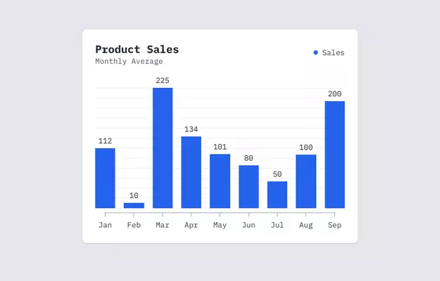
Bar chart with chart.js and tailwind css
This tailwind example is contributed by Kairi Greene, on 04-Jan-2023. Component is made with Tailwind CSS v3. It is responsive. similar terms for this example is Graph

Author Kairi Greene
Related Examples
-
 3 years ago13.5k
 -
 3 years ago13.4k
 -
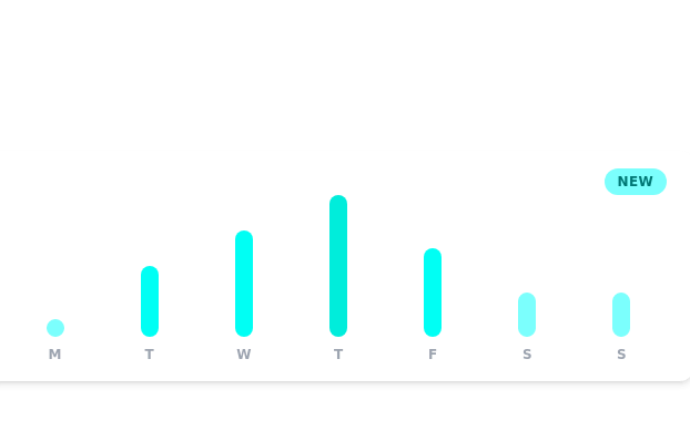 Daily growth chart
chart for showing data each day of the week
3 years ago11.5k -
 3 years ago12.2k
 -
 3 years ago12.2k
 -
 High-Performance Hotel Operations & AI Agent Testing Dashboard
A sophisticated, real-time command center designed for modern hotel management. This dashboard features deep integration for monitoring AI agent performance, guest sentiment, and room occupancy. Built with a "Mobile-First" philosophy, it demonstrates advanced data visualization, glassmorphism UI design, and a centralized state-management architecture. Perfect for showcasing full-stack capabilities in AI-driven automation.
3 weeks ago262 -
 9 months ago608
 -
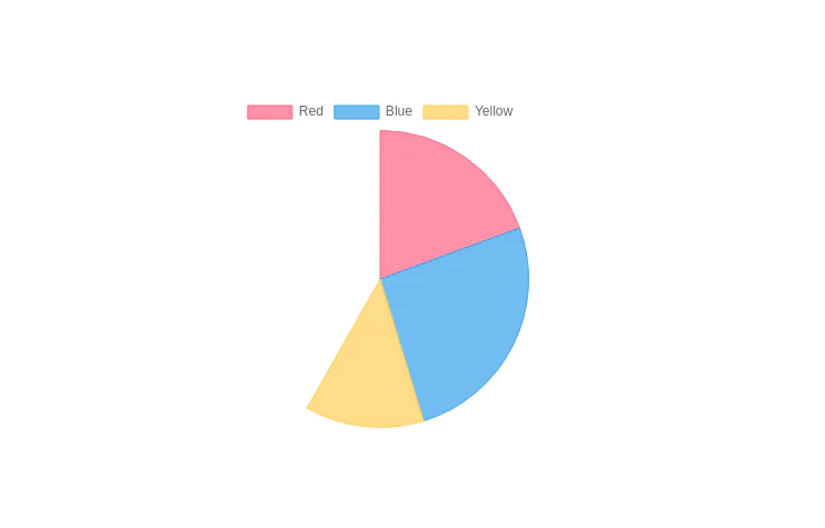
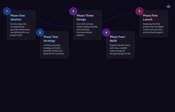 Infographic Component
Design a modern infographic component with Tailwind CSS. This component helps you display data in a clean, responsive, and visually appealing way. With utility classes, gradients, and smooth transitions, you can quickly build infographics that look professional and work perfectly on all devices.
6 months ago1k -
 Chat UI
The Chat UI is a responsive and interactive component designed for building messaging interfaces. Ideal for applications like customer support, social media, or team collaboration tools, it provides a modern, user-friendly layout for real-time communication.
1 year ago3.1k -
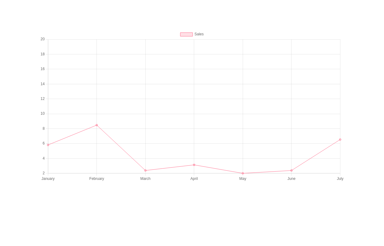
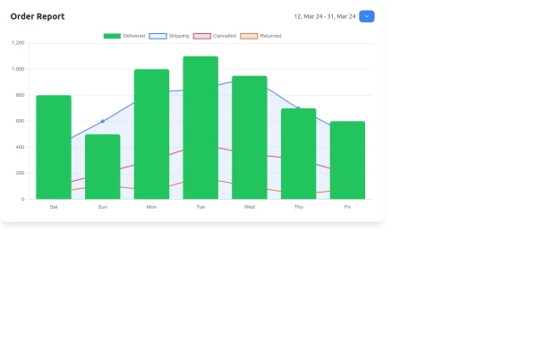 Interactive Order Report Chart with TailwindCSS and Chart.js
Create a stunning and interactive order report chart using HTML, TailwindCSS, and Chart.js. This chart combines bar and line graphs to visualize delivered, shipping, cancelled, and returned orders effectively. Perfect for dashboards and analytics pages with responsive design and clean aesthetics.
1 year ago1.6k -
 Dash.OS: Drag & Drop Dashboard Widget System
A fully interactive, freeform dashboard builder for the browser. Drop in widgets, drag them anywhere, resize to fit, and your layout is automatically remembered. Ships with a live Chart.js revenue chart, KPI stats, a task tracker, and a notifications feed, all in a single zero-dependency HTML file with dark/light mode built in.
1 week ago135 -
 Career Page
This is a career page component built in tailwind
1 year ago1.1k


Explore components by Tags
Didn't find component you were looking for?
Search from 3000+ components