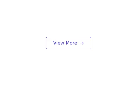
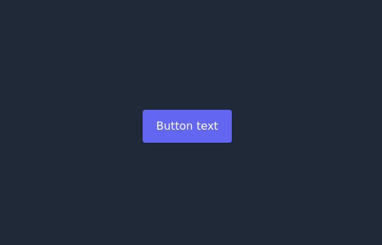
Primary secondary button pair
This tailwind example is contributed by Iris Callahan, on 25-Oct-2024. Component is made with Tailwind CSS v3. It is responsive. It supports dark mode.

Author Iris Callahan
Related Examples
-
 3 years ago19.6k
 -
Dark mode toggle button
Switch to dark mode without any hassle with this simple JavaScript hack. Sun night button
2 years ago21.6k -
 1 year ago1.9k
 -
 button
Background Studio
1 month ago309 -
 Hamburger menu button with open/close animation
Open and close animation onclick requires alpineJs
3 years ago20.1k -
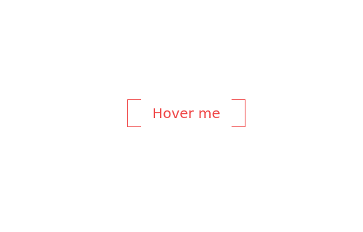
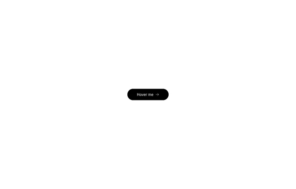 Button with hover effect
Button with light hover effect, responsive and suitable for light/dark mode.
6 months ago427 -
 Floating "Go to Top" Button with Tailwind CSS
🚀 Boost your website’s user experience with a sleek floating "Go to Top" button! This easy-to-implement solution uses Tailwind CSS for styling. ✔️ Smooth scroll to top ✔️ Clean and modern design ✔️ Responsive and animated effects Perfect for any website or portfolio! Add it today and make navigation effortless! 🔝💻
11 months ago853 -
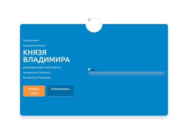 Home page 2
Отзывчивый логотип по центру. Интерактивные кнопки призыва к действию.
1 year ago915 -
 Botton hover
On hover Changes text
2 years ago7.1k -
Hover Button
Hover button then a overlay came from bottom to top
1 year ago2.2k -
 3 years ago11.2k
 -
 Ripple Button
Ripple Button is an interactive button component with a ripple animation that responds to user clicks
2 years ago13.5k


Explore components by Tags
Didn't find component you were looking for?
Search from 3000+ components