button
Background Studio
This tailwind example is contributed by nickosamba.nh21, on 12-Jan-2026. Component is made with Tailwind CSS v3. It is responsive. similar terms for this example are popup,dialog

Author nickosamba.nh21
Related Examples
-
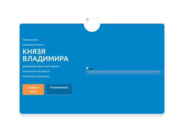 Home page 2
Отзывчивый логотип по центру. Интерактивные кнопки призыва к действию.
1 year ago917 -
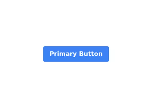 Primary Button
Elegant button
3 years ago12k -
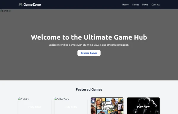 images games
images games
9 months ago577 -
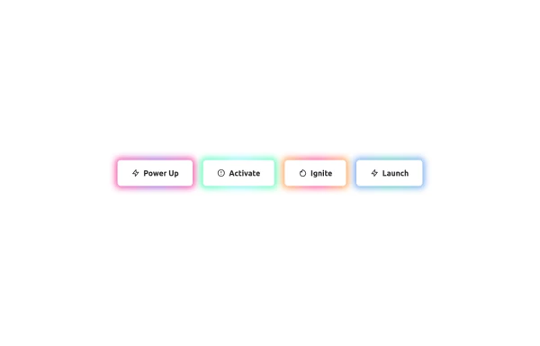
![Material 3 Buttons [Light]](https://tailwindflex.com/storage/thumbnails/material-3-buttons-light/canvas.min.webp?v=18) Material 3 Buttons [Light]
Material 3 Buttons [Light]Buttons that conform to Google's Material 3 design guidelines
10 months ago1k -
 1 year ago1.7k
 -
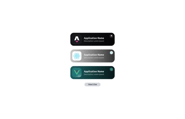 Applications Showcase
This is a stylish and interactive application showcase component designed for web use. It features the following elements: Background Styling: The main container has a rounded-rectangle shape (rounded-3xl) with a subtle white base overlaying a high-resolution background image, styled with background-size: 600px for an artistic touch. The image itself dynamically serves as a backdrop, giving the component a layered appearance. Main Icon: A small circular icon, located at the top-right corner, appears with smooth hover effects: Enlarges to double its size (scale-[2]). Rotates (rotate-[410deg]). Moves diagonally upwards-right (translate-x-3, -translate-y-3). These transitions occur over a duration of 1 second (transition duration-1000). Overlay Gradient: A transparent gradient overlay (bg-gradient-to-l) adds a polished depth effect, transitioning from black (from-black/80) to lighter shades. App Icon and Info: Icon: The app icon is a smaller, bordered square image (rounded-2xl) with hover shrink animations (group-hover:scale-95). Text: A bold application title (text-md font-semibold) with hover-animated underline effects that gradually expand from left to right. A short app description styled as secondary text. Call-to-Action Button: Below the card is a subtle, rounded button (rounded-full) encouraging interaction. It features: A hover effect with color inversion (gray to black). A lift effect (hover:-translate-y-1) when hovered. This component is perfect for modern app showcases, offering a dynamic, user-friendly visual experience. It ensures a professional look while engaging users through smooth animations and clear calls to action.
1 year ago2.8k -
 Playstore Button
Download on the play store button
3 years ago15k -
 Life Tree
by salvator
10 months ago988 -
1 year ago2.5k
-
3 years ago18k
-
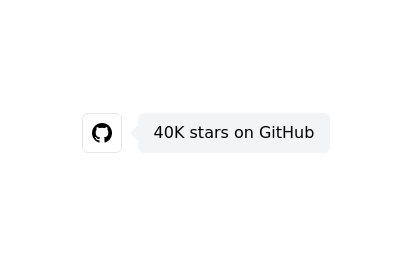 Github stars button
Display the GitHub stars received by your project
2 years ago9k -
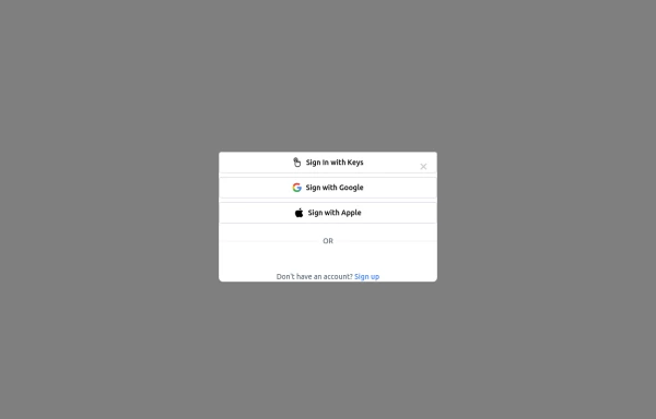 Login popup modal
centered modal for gaining more attention from users, it also has social login buttons.
11 months ago585


Explore components by Tags
Didn't find component you were looking for?
Search from 3000+ components