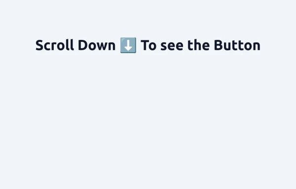
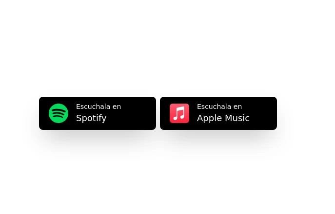
My First Component - Buttons
buttons and flexbox
This tailwind example is contributed by Felipe Pinheiro, on 26-Jun-2024. Component is made with Tailwind CSS v3. It is responsive.

Author Felipe Pinheiro
Related Examples
-
 3 years ago16.6k
 -
 Floating "Go to Top" Button with Tailwind CSS
🚀 Boost your website’s user experience with a sleek floating "Go to Top" button! This easy-to-implement solution uses Tailwind CSS for styling. ✔️ Smooth scroll to top ✔️ Clean and modern design ✔️ Responsive and animated effects Perfect for any website or portfolio! Add it today and make navigation effortless! 🔝💻
11 months ago851 -
 3 years ago12.7k
 -
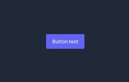
Button
Material Button
1 year ago1.4k -
Color Changing Gradient Button
Color Changing Gradient Button
1 year ago3.7k -
 3 years ago12k
 -
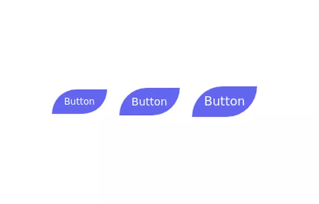
 Life Tree
by salvator
9 months ago953 -
 Ripple Button
Ripple Button is an interactive button component with a ripple animation that responds to user clicks
1 year ago1.2k -
 flower
by salvator
9 months ago1.4k -
 Button group
nice and simple buttons with a hover effect
3 years ago8.3k -
 1 year ago2.7k
 -
 1 year ago1.8k


Explore components by Tags
Didn't find component you were looking for?
Search from 3000+ components